Matching Gift Software Accessibility in the Higher Ed Sector
The higher education sector has become increasingly focused on ensuring its websites and other materials are user-friendly for all sorts of users—including those with disabilities—in order to provide a positive user experience and adhere to regulatory requirements. As a result, more and more schools are taking a proactive approach to matching gift software accessibility as well.
For many school fundraisers, this involves investing in a platform that’s dedicated not only to increasing matching gift revenue but also to ensuring the fundraising channel is in tune with the highest level of accessibility standards to date.
As of today, Double the Donation is the only matching gift vendor with a VPAT (or Voluntary Product Accessibility Template) and is passing according to WCAG guidance. This document is used to assess and communicate the accessibility of a software application according to various standards and guidelines—such as the Web Content Accessibility Guidelines (WCAG) or Section 508.
While it makes it easy to explore the provider’s accessibility standards across various schools that have implemented its tools, other matching gift software vendors are not as transparent, or accessibility-focused, in their offerings.
So, where is your school standing—and what can you do to heighten accessibility as you pursue matching gift fundraising opportunities with fervor? Keep reading to find out!
In this guide, we’ll cover:
- Analysis of 100 Top Schools’ Matching Gift Pages
- Why Matching Gift Accessibility is Essential Across Higher Ed
- Key Components to Consider For Matching Gift Software Accessibility
- Bonus: How the Software Stacks Up
- Next Steps + Additional Resources
As we take a closer look at many leading higher education institutions’ digital content, we can better determine the extent to which they prioritize accessibility regarding matching gifts. This will allow us to uncover critical errors that may cause these schools to fall out of line with today’s accessibility standards. And that’s certainly not what you want for your school’s online community.
So, without further ado, let’s dive in.
Analysis of 100 Top Schools’ Matching Gift Pages
A dedicated matching gifts web page is one of the most powerful matching gift marketing tools an educational institution—or other nonprofit—can employ. This resource is typically hosted on the college or university’s website along with its additional online fundraising materials (e.g., Ways to Give pages, donation forms, or campaign landing pages).
Fun fact: A recent study of matching gift operational statistics reports that over 93% of the largest fundraising organizations have a matching gift page on their website.
In most cases, this asset encompasses a brief overview of the matching gift opportunity, how donor participation positively impacts the institution, and an employer search tool with which users can determine their eligibility for the programs. Such a resource helps schools inform their supporters about the impact and availability of matching gift programs, ultimately driving more corporate and individual revenue for their institution.
However, not all Match Pages produce the same amount of value —and an alarming discovery indicates that many of the nation’s most prominent higher education institutions’ matching gift pages have been flagged for accessibility issues.
Thus, we’ve conducted an analysis of the match pages from 100 top colleges and universities in order to identify concerns regarding web accessibility and other areas with room for improvement.
Browse the table to peruse leading institutions’ matching gift pages
Through our research, we’ve determined that matching gift software accessibility is on the rise. In the last few years, there’s been more than 70% growth in the number of higher education institutions employing accessible matching gift software, as compared to their inaccessible counterparts.
However, there’s still a long way to go, with numerous institutions continuing to face WCAG compliance issues.
In the next few sections, we’ll address why this is a critical problem facing colleges and universities everywhere, what to look for when examining your own institution’s matching gift accessibility, and specific recommendations for actionable next steps.
Why Matching Gift Accessibility is Essential Across Higher Ed
When it comes to fundraising, an institution’s potential is not likely to be met if there are barriers to giving that come with an inaccessible website.
As a result, there are a few key benefits of ensuring highly accessible matching gift fundraising efforts.
Ensuring a Positive User Experience
Accessibility produces inclusivity. This allows supporters of all kinds to support and participate in your school’s fundraising and matching gift efforts—including those with disabilities. And that means more donors to support your cause and more dollars funneling into your school.
On the other hand, the alternative (an inaccessible matching gift experience) leads to user frustration, abandoned donations, and incomplete matches. There are enough roadblocks facing the matching gift process already—you don’t want to add any more by failing to ensure accessibility.
Not to mention, your happiest donors are the ones who are most likely to continue supporting your institution time and time again, ultimately resulting in long-term contributors to your school community. And those are typically the ones who have the most seamless giving experience in the first place!
Adhering to Digital Accessibility Requirements
Online accessibility should be a priority for all organizations. But the stakes are even higher when it comes to publicly-funded establishments like colleges and universities.
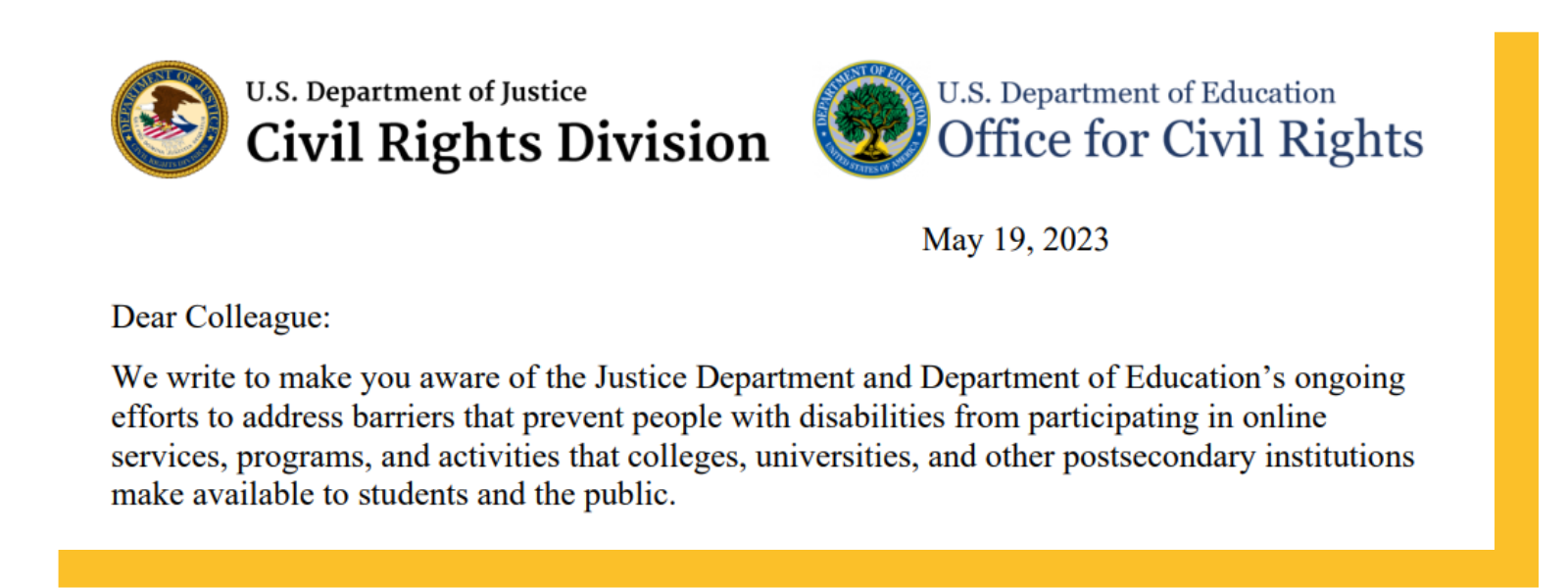
In fact, a 2023 letter penned by the Departments of Justice and Education issues a reminder to higher education institutions regarding the importance of accessibility compliance. The statement encourages institutions to regularly audit their own web content to ensure it meets the criteria specified under the ADA (or Americans with Disabilities Act) and Section 504 of the Rehabilitation Act. In order to do so, schools have long been encouraged to adhere to the WCAG (Web Content Accessibility Guidelines) with a goal of at least level AA conformance.
In the event that a publicly-funded institution does not meet the required level of compliance, however, the school may be penalized through an investigation, lawsuit, or monetary fine. Each of these consequences results in a loss of time, effort, and resources—which is the exact opposite of what a fundraising initiative should offer.
Thus, investing in an accessible matching gift solution is a must.
Key Components to Consider For Matching Gift Software Accessibility
There’s a lot that goes into an accessible matching gift fundraising strategy, and it helps to know which types of elements you’re looking for as you audit your own efforts.
The WCAG, or Web Content Accessibility Guidelines, classifies criteria based on the gravity and impact of specific accessibility indicators. This is organized in a few ways:
Conformance Levels
- A (Essential) — The basic level of accessibility conformance and the minimum standard for inclusivity. This ensures digital content is accessible to many individuals with common or less severe disabilities.
- AA (Ideal Support) — A higher level of accessibility compliance that incorporates all Level A requirements while also addressing increasingly complex issues. This standard is required for many government agencies and other publicly funded organizations.
- AAA (Specialized Support) — This highest level of conformance primarily addresses institutions and digital content that serves specialized audiences.
Severity Ratings
- Low severity — Identified concerns may or may not introduce some difficulties for people with disabilities. But regardless of whether difficulties are introduced, they do fail a WCAG success criterion.
- Medium severity — Identified concerns make it very difficult for people with disabilities to access content or complete a task. Such users may be required to take many additional steps or identify a different way to complete the intended action.
- High severity — Identified concerns may block people with disabilities from accessing content or completing a task entirely.
Additionally, a web content audit typically encompasses a few overarching categories of accessibility criteria. For example:
- Screen readers
- Keyboard navigation
- Color contrast
- Browser zoom
- Text spacing
In this analysis, we chose to focus on the first three as areas with significant room for improvement across the schools we studied. For each category, we’ll provide a total score (out of 100 possible points) based on the number of top 100 institutions successful in that criterion.
Screen Readers
A screen reader is one of the most-used forms of assistive technology. Commonly employed by individuals with visual impairments, the use of such a tool enables audiences to access critical information in an accessible format.
By confirming that your institution’s website and other digital fundraising materials are screen reader-friendly, you can ensure knowledge about matching gift opportunities is inclusive and obtainable. Doing so typically includes the provision of adequate alternative text for images and other non-text content—as well as logically structured and ordered materials.
Unfortunately, our analysis of top institutions’ matching gift pages indicates that screen reader accessibility saw the most numerous issues. At the time of the study, an average of 4.3 low-severity issues, 6 medium-severity issues, and 1.7 high-severity issues were identified on each school’s matching gift search tool.
Total score across Top 100 schools: 30/100*
*Of the schools included in the analysis, we found that those using Double the Donation’s matching gift tool saw no significant accessibility concerns
While we can’t list all the issues we uncovered, we wanted to pull a few examples of medium and high-severity issues noted on many schools’ pages—specifically those using tools besides Double the Donation.
These include:
- Alternative text not announced for the ‘Affinaquest’ graphic link on the search tool (medium severity; failing Success Criterion 1.1.1 according to WCAG)
- Status message not announced by the screen reader (medium severity; failing Success Criterion 4.1.3)
- Role not announced for the ‘Search’ button (high severity; failing Success Criterion 4.1.2)
- Search suggestion not announced automatically and not announced by the screen reader (medium severity; failing Success Criterion 4.1.3)
- Search suggestion not read by the screen reader (high severity; failing Success Criterion 1.3.1)
The overall impact? The absence of alt text for images, unnotified dynamic changes, incorrect control roles, and unannounced content on an institution’s matching gift page all significantly impair accessibility for users with disabilities. This results in a loss of information, confusion, and missed opportunities—negatively affecting the results of the school’s matching gift fundraising efforts.
Keyboard Navigation
Accessible keyboard navigation is critical for users with mobility impairments who rely on keyboard input to effectively maneuver through a website. As a result, a college or university’s matching gift web page and search tool should be easily navigable using only a keyboard.
This not only meets accessibility standards but also ensures that everyone, regardless of their physical abilities, can access and utilize the information without a hitch.
Total score across Top 100 schools: 32/100*
*Of the schools included in the analysis, we found that those using Double the Donation’s matching gift tool saw no significant accessibility concerns
Here are a few key areas that we noted inaccessible keyboard navigation throughout selected schools’ matching gift digital resources:
- Focus doesn’t move to the ‘X [Clear]’ button (medium severity; failing Success Criterion 2.1.1 according to WCAG)
- Focus indicator is not available on the ‘Hepdata’ and ‘Terms of Use’ links (medium severity; failing Success Criterion 2.4.7)
The overall impact? Absence of streamlined keyboard navigation compatibility on a matching gift page hinders users with visual and mobility impairments from accessing essential matching gift information. Without clear focus indicators, users may struggle to locate and interact with necessary elements, leading to additional roadblocks and incomplete matches.
Color Contrast
Color contrast is essential for digital accessibility. After all, it enables individuals with vision impairments—including low vision, color blindness, and more—to clearly distinguish text and graphic content. Thus, it’s critical that schools prioritize sufficient color contrast of at least 4.5:1. as they design their matching gift web pages and incorporate any associated software.
Total score across Top 100 schools: 30/100*
*Of the schools included in the analysis, we found that those using Double the Donation’s matching gift tool saw no significant accessibility concerns
Unfortunately, not all schools were found to use suitable color contrast on their matching gift pages, which ultimately causes accessibility issues for users. These are a few instances in which insufficient contrast was noted:
- Placeholder text ‘Search’ provides textual information yet fails the color contrast ratio [measuring between 2.2:1 and 4.2:1, depending on the tool] with the content background (medium severity; failing Success Criterion 1.4.3 according to WCAG)
- Text providing company-specific matching gift program guidelines, like minimum and maximum donation amounts and more fails color contrast ratio [measuring at 2.2:1] with the content background (medium severity; failing Success Criterion 1.4.3)
- Text ‘Terms of Use’ fails the color contrast ratio [measuring at 3.6:1] with the content background (medium severity; failing Success Criterion 1.4.3)
The overall impact? Insufficient color contrast on a college or university’s matching gift resources results in difficulty distinguishing essential textual information—such as eligibility criteria—from background elements. When donors are hindered from proper perception and comprehension of the information they need to submit a match, they’re more likely to miss out on requesting available funding on your school’s behalf.
Bonus: How the Software Stacks Up
When it comes to selecting matching gift software for your organization, accessibility should be a top priority. In this study, we looked at three matching gift solutions:
- Affinaquest’s AffinityX2 Auto Match tool
- HEPdata’s eMatch Donor Lookup tool (also under the Affinaquest brand)
- Double the Donation Matching tool
And here’s an overview of their respective rankings:
| Matching Gift Tool | Pass/Fail? | Score |
|---|---|---|
| 360MatchPro | PASS | 100% |
| eMatch Donor Lookup | FAIL | 63.9% |
| AffinityX2 Auto Match | FAIL | 64.7% |
Now, for a more detailed breakdown by platform:
The two tools offered by Affinaquest’s HEPdata exhibit similar performance in terms of WCAG compliance. The eMatch Donor Lookup tool had 6 level A failures and 6 level AA failures, with an overall pass rate of 63.9%. Remember: level A represents the essential, while AA is what you really want—so this score indicates that the tool is not meeting basic requirements.
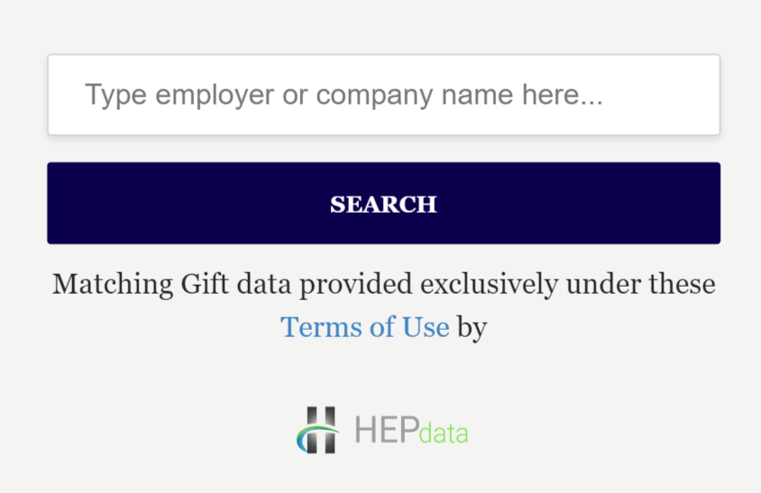
Meanwhile, the AffinityX2 Auto Match tool had 8 level A failures and 5 level AA failures, with a slightly higher pass rate of 64.7%.
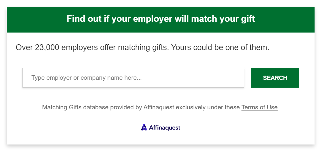
Although these tools have made efforts to meet accessibility standards, their results indicate areas for improvement. By addressing the issues identified above, this vendor would be able to provide a more inclusive experience for all users.
Meanwhile, Double the Donation Matching stands out as the leader of the pack.
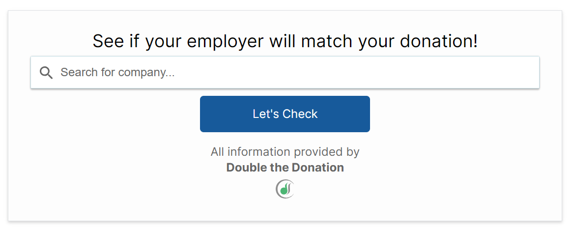
It achieved a 100% compliance rating with WCAG success criteria in both levels A and AA, indicating a strong commitment to accessibility and ensuring all donors can access the tool without encountering substantial barriers.
Not to mention, the schools utilizing Double the Donation’s tool were significantly more likely to score highly in terms of an accessible matching gift strategy—including across screen readers, keyboard navigation, color contrast, browser zoom, and text spacing.
Next Steps + Additional Resources
If your institution has yet to invest in a dedicated matching gift solution, now is the perfect opportunity to do so. And as you weigh your options between providers, make sure that accessibility is at the forefront of your decision! Meanwhile, if your school is currently equipped with a matching gift tool, determine whether the software is meeting your community’s accessibility needs.
Remember: a fully accessible platform is a necessity not only for driving maximum matching gift revenue but also for adhering to any legal requirements imposed on your institution.
Our findings indicate that Double the Donation Matching is the ideal choice for just about any college or university looking to pursue accessibility in matching gifts. This provider’s commitment to accessibility compliance causes it to stand out from the crowd, making matching gift opportunities more readily available than ever before.
Check out the following resources to further enrich your knowledge of matching gift fundraising for higher education:
- Prioritizing Accessibility in Matching Gift Fundraising. Explore the value of accessible matching gift efforts with various in-depth strategies and resources. This must-read post can empower your team as you establish an inclusive culture of giving!
- Winning With Matching Gifts and Higher Education: A Guide. This comprehensive guide provides a higher ed-focused look at matching gift fundraising. Plus, it’s complete with tips, tools, and case studies from colleges and universities to be inspired by.
- How to Promote Matching Gifts with the Google Ad Grant. Interested in free advertising space valuing up to $10,000 per month? In this blog, uncover expert advice on how the Google Grant can help promote matching gifts (and increase awareness) effectively.
![Matching Gift Software Accessibility in the Higher Ed Sector [Feature Image with Title Text] Matching Gift Software Accessibility in the Higher Ed Sector [Feature Image with Title Text]](https://gettingattention.org/wp-content/uploads/2023/10/Getting-Attention_Matching-Gift-Software-Accessibility-in-the-Higher-Ed-Sector_Feature.jpg)


