Our Top 8 Tips and Tricks for Designing Nonprofit Logos
Whether it’s a portrait of a mythical siren in a green circle or a red-and-white Play button, logos are all around us. Many for-profit companies use logos to identify their products and services, but nonprofit organizations have just as much to gain from effective logo design!
In this guide, we’ll walk through all you need to know to start designing nonprofit logos, including:
- What Makes a Good Nonprofit Logo?
- 8 Tips for Designing Nonprofit Logos
- Tools to Get Started With Designing Nonprofit Logos
Every nonprofit can benefit from a well-designed logo, whether your organization is just starting out or has been around for some time and wants to take its branding to the next level. Using the tips and tricks in this guide will put you well on your way to creating the best one.

What Makes a Good Nonprofit Logo?
The most important aspect of a logo is that it reflects what you want your nonprofit’s brand to look like. Branding is what makes your nonprofit stand out in your supporters’ minds. After all, 93% of nonprofits believe donor engagement is positively impacted by a strong brand identity—and your logo is the center of that brand.
Kwala recommends nonprofit logo design tips such as:
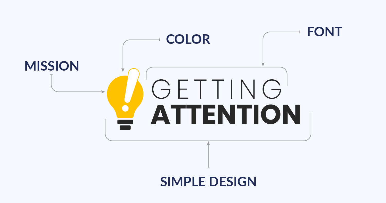
- Emulating your organization’s mission. First and foremost, your logo should illustrate your nonprofit’s mission. Ideally, your mission will be immediately obvious to anyone who sees your logo. Consider which images, symbols, or words best represent your organization’s purpose.
- Choosing the right colors. Colors have the power to convey emotions, which can urge viewers to learn more about your nonprofit. For example, a red logo might convey a sense of urgency and prompt viewers to quickly get involved.
- Using readable fonts. Different fonts convey varying moods, so be sure to choose one that accurately reflects your nonprofit’s tone. If you have the time, consider creating your own font to make your logo even more unique.
- Keeping it simple and timeless. Identify the basic elements that are most essential to visualizing your nonprofit’s mission. Keeping the design simple not only helps your logo stand out to viewers but also ensures it remains relevant and effective years from now.
Your logo influences how your supporters perceive your nonprofit, so you’ll want to make it memorable, impactful, and unique.
8 Tips for Designing Nonprofit Logos
An effective marketing strategy uses your brand’s logo to give the audience an idea of who you are and what you stand for with a single glance. Plus, when you add a logo to each of your marketing materials, it helps your mission to stick in potential supporters’ minds.
To design the logo that accomplishes this, you’ll need to put a good amount of time and effort into the process. Get started with these eight helpful tips:
1. Start with your mission statement.
Your nonprofit’s mission statement is the core of all the work you do. So, naturally, you’ll want to express it through your logo design. Supporters should be able to tell, generally, what your nonprofit does with a quick glance.
You can market your nonprofit’s mission through your logo design by following these three steps:
- Carefully read over your nonprofit’s mission and vision statements.
- Write down whatever words, symbols, and images come to mind when you think of your mission.
- Consider what logo colors could be associated with the ideas you’ve brainstormed.
One example of a nonprofit with a mission-centered logo is Feeding America, whose mission is to ensure equitable access to food for everyone in the United States:
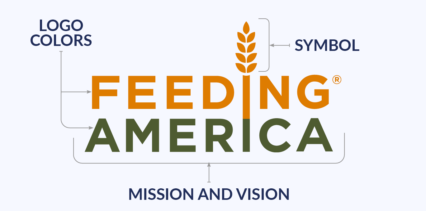
The grain stalk “growing” from the two I’s in the logo is a common symbol related to food security. The colors they chose also work well with their mission—green is associated with peace and life, and orange is associated with friendliness and affordability.
2. Brainstorm on paper before moving to digital design platforms.
When you create your nonprofit’s logo, you have a lot of options in terms of what digital design tools to use. But your most valuable tools might just be a pencil and paper.
In many cases, it’s easier to navigate the features of a digital design tool when you already have a visual reference for what you want the finished product to look like. Plus, if you’re working with a professional graphic designer, you may be able to get your ideas across to them more effectively with a sketch than if you just wrote down or told them your vision for your nonprofit’s logo.
3. Keep it simple, but make sure it stands out.
Good graphic design is all about balance, especially when it comes to creating logos. On one side of the spectrum, you need to make your logo stand out from other similar organizations so that supporters recognize your nonprofit. But on the other side, simpler designs are more memorable and tend to stand the test of time.
The Girl Scouts logo design is a good example of this balance:
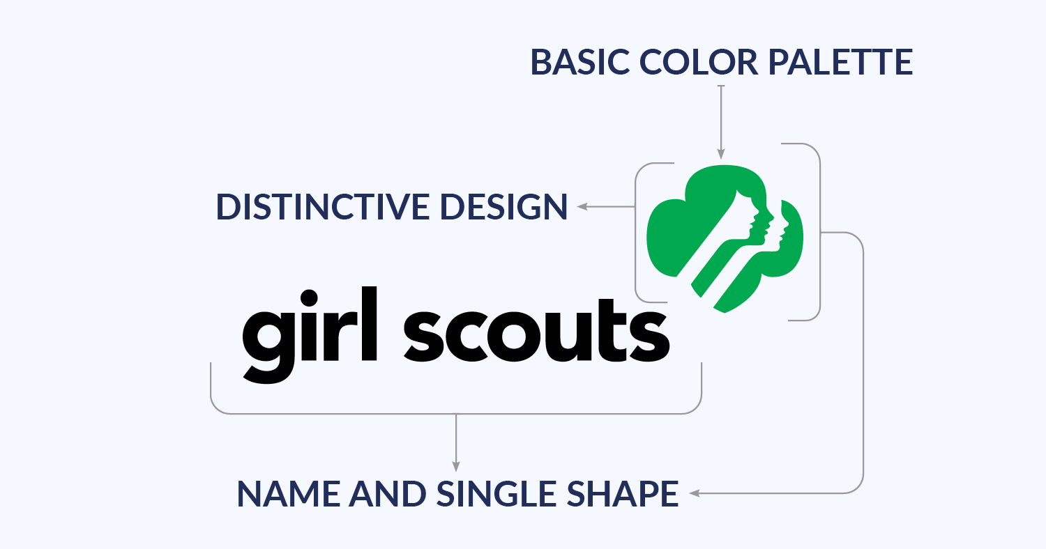
They use a basic color palette of white, black, and their trademark green in their logo, which is made up of their name and just one shape. But that shape is a trefoil, which is distinctive to the Girl Scouts because it represents the three points of the Girl Scout Promise. The organization makes its logo even more memorable (and delicious!) by selling shortbread Girl Scout Cookies in the trefoil shape.
4. Make sure all text is readable.
To make your logo stand out, you might want to write your organization’s name in a unique font, have the words read in a direction other than horizontal, or use standout colors for text. Those ideas are all well and good—as long as you can still read the words easily.
If your logo uses a custom typeface or has vertical or diagonal text, it’s often best to make the words the main focus of the design. Bold text colors are also generally more readable than pastels or light neon shades. But whatever color you choose, make sure it contrasts with the background (light-colored text on a dark background or dark text on a light background tends to work well).
For example, the Trevor Project’s logo does a great job of giving text a unique look but ensuring it’s readable.
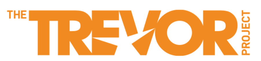
Whether it’s against a light or dark background, the logo’s orange text is striking and contrasts well. And even with the vertical direction and hidden star, the text is fairly easy to read.
5. Design with your audience in mind.
A good logo design will resonate with your nonprofit’s audience. Besides being able to identify your nonprofit by its logo, your supporters should relate to the logo in some way.
To create a logo your supporters connect with and understand, you’ll want to do some research on these audience-related topics:
- Demographics, such as age, gender, location, and family status.
- Psychographics, which refers to your audience’s interests, values, beliefs, and motivations.
- Direct feedback, because after you make inferences about your audience from their demographic and psychographic characteristics, you can test your logo design on some supporters and adjust it based on their reactions.
If you work with a professional graphic designer, be sure to clearly explain the audience you’re trying to reach so the experts can design a logo that meets your nonprofit’s needs.
The Humane Society of the United States is an example of an organization with a logo design that fits its audience.
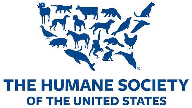
The logo is shaped like the country where their supporter base primarily lives and includes a variety of animals that audience members may be interested in helping.
6. Remember that your first idea may not be your best idea.
You don’t have to make the perfect logo on the first try. When your organization creates its first logo, the design will be more effective if you revise it several times based on feedback from inside and outside your nonprofit.
Also, if you’re designing a nonprofit logo with your audience in mind, you’ll probably notice that your audience will change over time. Both for-profit and nonprofit organizations will rebrand and roll out new logos when they feel it’s time to adapt to a new social climate. So, keep in mind that your logo will be most effective if it evolves with your audience’s needs and interests.
The YMCA is one nonprofit that has rebranded several times in its long history.
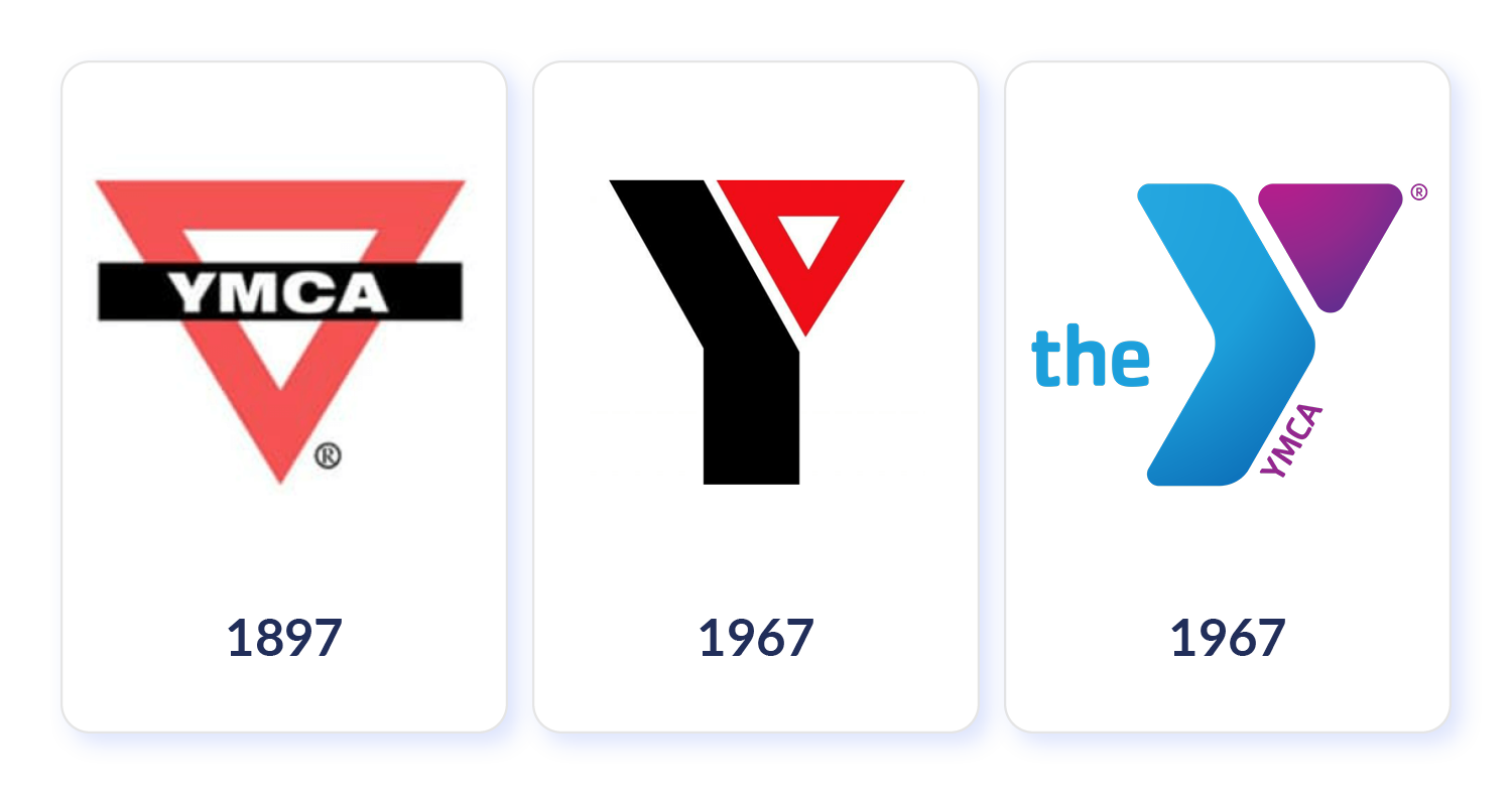
The two black-and-red, sharp-edged logos that the organization used throughout the 20th century contrast strongly with the version they started using in 2010. The new logo has softer edges and uses a variety of colors to appeal to modern audiences. Plus, it focuses on the letter Y to emphasize inclusion, but it also includes the acronym YMCA because the organization is still known by both names.
7. Create several versions of your logo.
Once you’ve settled on one new logo design, you’ll want to create several versions of it. Each place where you use your logo will have a different amount of available space, so you’ll need a logo that can fit each one. For example, you’ll be able to fit a much larger logo on a t-shirt than you would on a social media graphic.
Designing your logo as a vector will come in handy so you can change its size without affecting image quality. If you need help with this, contact a professional graphic designer. Also, you’ll want a few variations of your logo to fit the aesthetic of each piece of content you create.
To look at an example, the United Way uses several different versions of its nonprofit logo across its marketing materials.
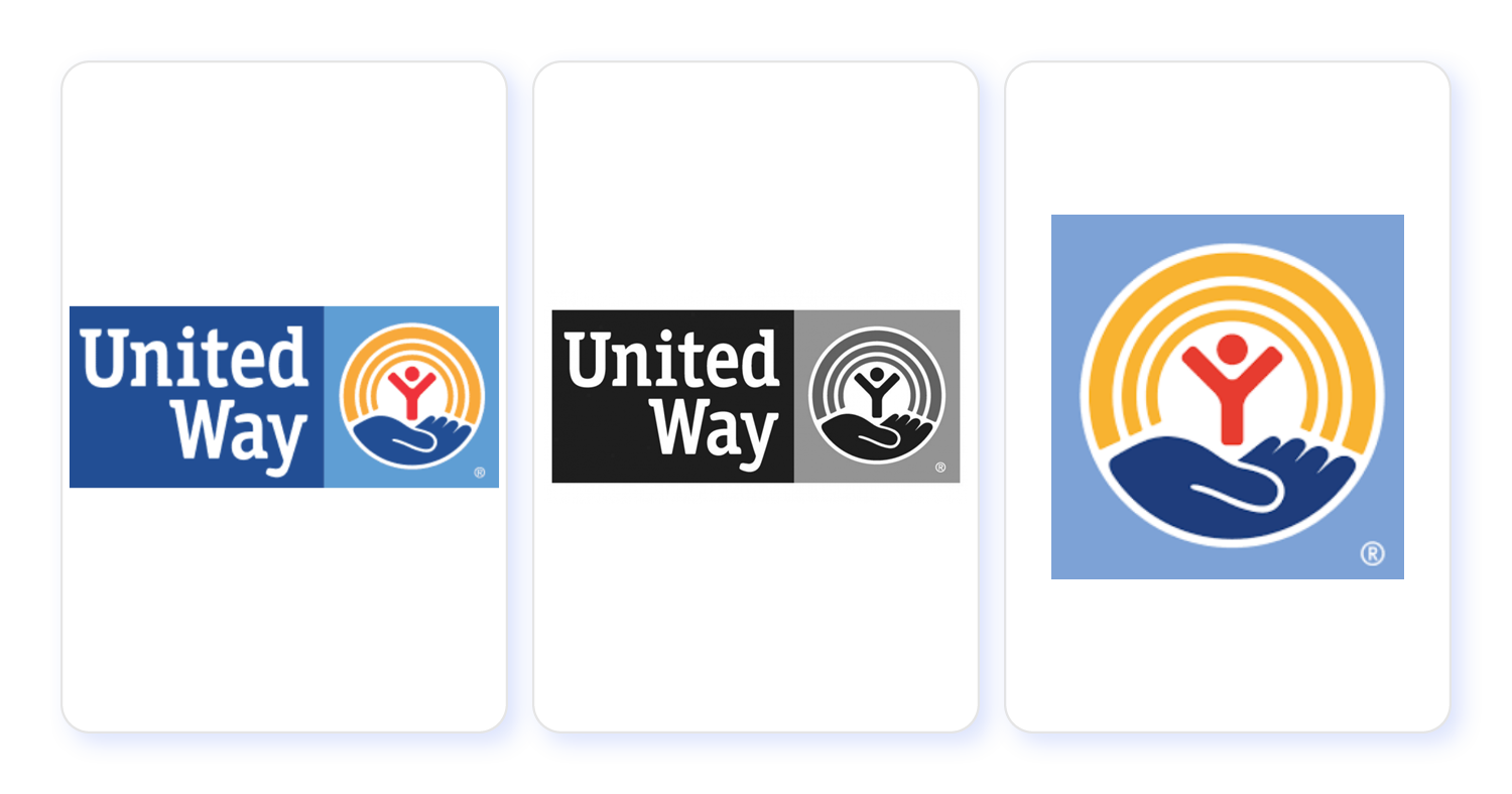
They have a main color logo with the organization’s name and a symbol, one with the same elements in black and white, and a version with only the symbol and no text. Each design is obviously a variation on the same theme, but different versions work in different situations. For instance, the black-and-white logo is the easiest to print, and the symbol-only version fits well in tight spaces.
8. Experiment with your designs in context.
When your logo design is finished, you’ll put it on every piece of marketing content your organization creates, including:
- Your website
- Email newsletters
- Social media posts
- Branded merchandise
- Signs or billboards
- Direct mail
- Print and digital flyers
To make sure you like how your logo looks and envision how it will fit into each content type, create a few sample designs. Once you come up with some ideas that work well, add the samples to your organization’s brand guide for reference over time.
charity: water is one nonprofit that uses its logo in creative ways across different marketing materials.
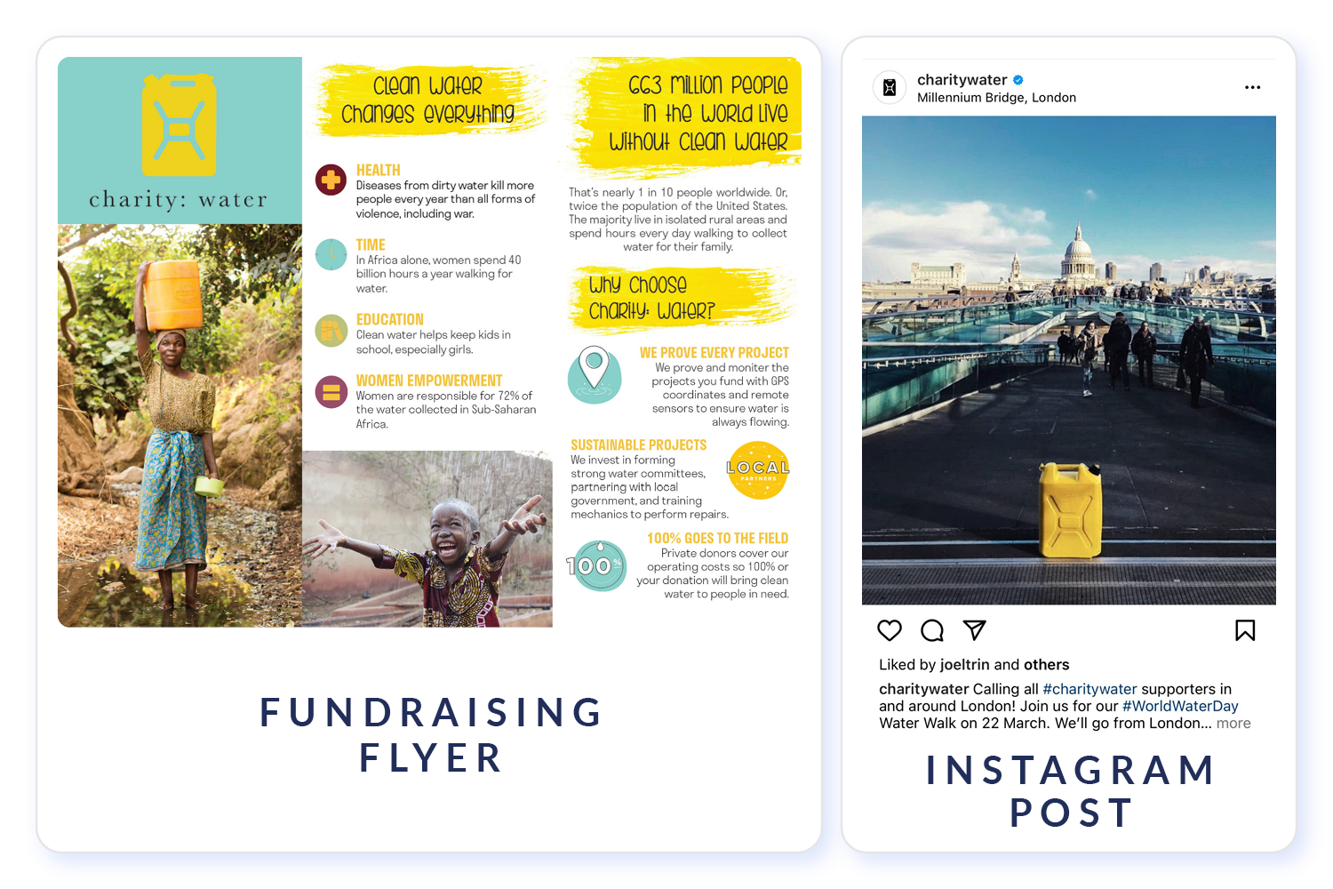
In the example above, they used their logo in place of a title on a flyer that gives an overview of their organization, and they made a physical version of the design to fit into an Instagram photo.
Tools to Get Started With Designing Nonprofit Logos
As mentioned previously, there are a number of graphic design tools available to help you create a logo for your nonprofit. Some of our favorites include:
- Canva
- DesignMantic
- Adobe Express
These tools all work well for beginner graphic designers and can easily be used in-house. But if you want to take your logo design to the next level, your best bet is to partner with nonprofit graphic designers.
Kwala is a graphic design service that connects nonprofits with a team of experienced professionals. These designers then work with nonprofits to create logos as well as a variety of other graphics. Their subscription model gives your organization an unlimited number of designs and revisions each month for a flat rate. If you want to try out Kwala’s services before committing to the monthly rate, you can also request a quote on a one-off project.

Additional Nonprofit Logo Design Resources
A strong logo is central to your nonprofit’s branding and marketing, which fuels your ability to make an impact. Ultimately, your logo should reflect your organization’s mission and resonate with your audience. Use the tips in this guide and the resources available to you—particularly the help of nonprofit graphic design experts like those at Kwala—to help create the best logo for your nonprofit.
For more information on nonprofit logo design, check out these resources:
- 5 Steps to Create a Great Nonprofit Graphic Design Strategy. Logos are just one part of effective nonprofit graphic design. Learn what else your nonprofit needs to do to take your graphic design strategy to the next level.
- 100+ Best Nonprofit Logos to Inspire Your Team. It’s often helpful to look at other nonprofits’ logos to get inspiration for your own. To get started, take a look at these examples.
- Kwala: Quality Subscription-Based Graphic Design. Are you ready to partner with nonprofit graphic designers to create a new logo for your organization? Fill out Kwala’s onboarding form to connect with experts.