Nonprofit Email Marketing: How to Create Clickable Messages
Email may not be the newest digital marketing tool, but when done right, it’s one of the most impactful for nonprofits. Effective nonprofit email marketing gives you a direct line to your supporters, allowing you to share project updates, promote events, and drive donations.
From crafting the perfect subject line to sending the right types of emails, this guide will provide the insights you need to elevate your email strategy and transform your nonprofit’s emails into a game-changing communication channel:
- The Power of Effective Nonprofit Email Marketing
- Nonprofit Email Marketing Best Practices
- Types of Nonprofit Emails To Send
- Key Nonprofit Email Marketing Metrics To Track
- How Google Ads Can Fuel Your Email Marketing Efforts
Let’s turn your emails into a powerhouse strategy for supporter engagement and fundraising success.
The Power of Effective Nonprofit Email Marketing
When your team invests time into crafting strong nonprofit emails, you’ll experience these benefits:
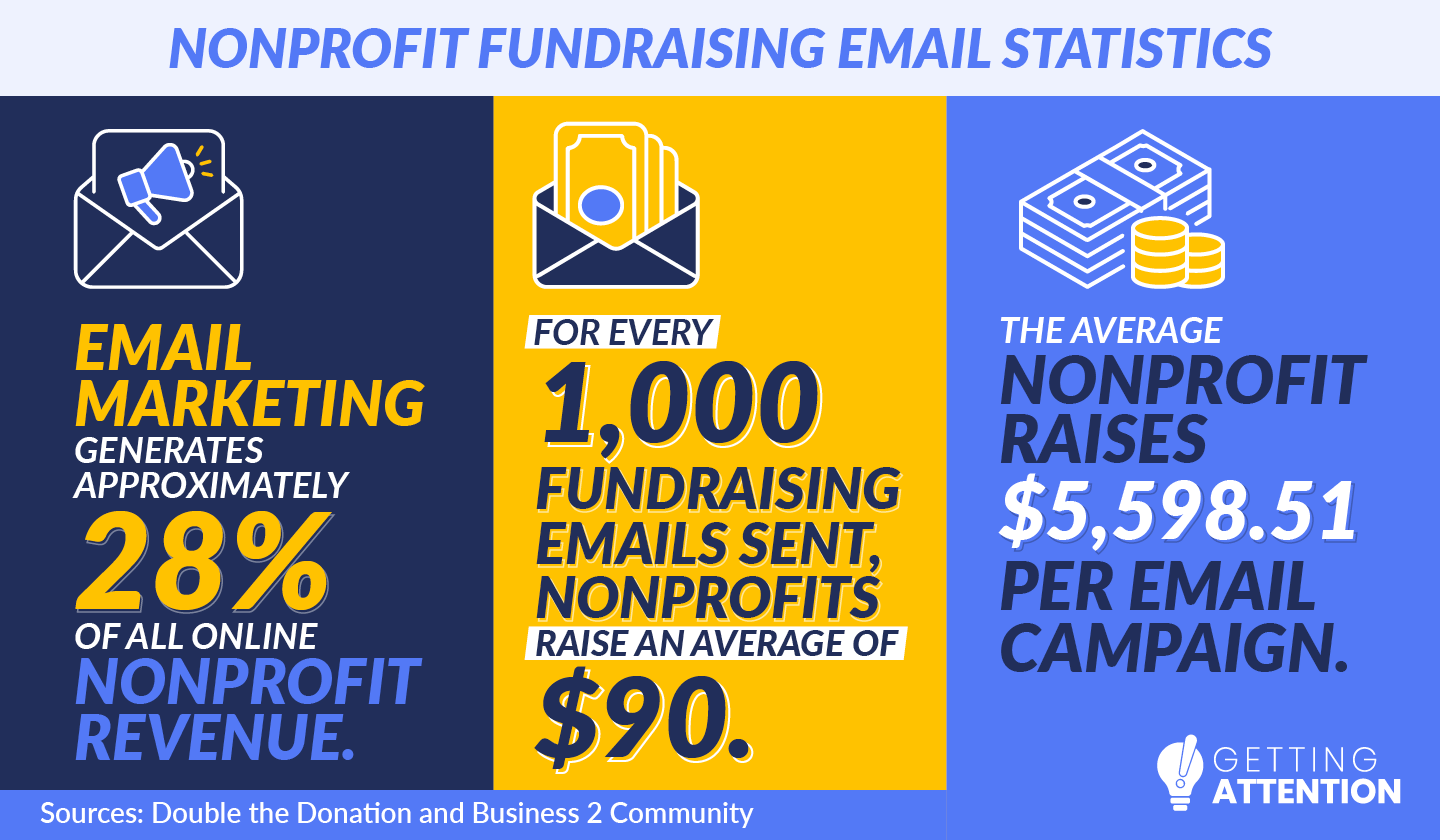
- Save on marketing costs: Email marketing is an affordable way to reach a large audience. In fact, email marketing generates about 28% of all online nonprofit revenue, demonstrating its power to drive donations.
- Build relationships: Regular email communication nurtures and strengthens connections with supporters. Targeted personalized messages create a sense of community.
- Educate supporters: Emails inform your audience about your mission, updates, and impact. Sharing compelling stories and data will deepen their understanding of your mission.
- Promote events: Email campaigns boost attendance at upcoming events. Whether it’s a virtual webinar or an in-person fundraiser, emails spread the word.
- Inspire donations: Well-planned drip campaigns guide supporters through the giving journey, inspiring donations over time. Marketing research indicates that, on average, nonprofits raise $90 for every 1,000 fundraising emails sent, highlighting the potential impact of consistent communication. What’s more the average nonprofit raises $5,598.51 per email campaign.
- Easily track results: Email marketing platforms provide metrics like open rates, click-through rates, and conversions, allowing for easy tracking and optimization.
By leveraging cost-efficient and trackable email campaigns, your nonprofit can develop an educated community of supporters, earn revenue, and ultimately maximize its impact.
Nonprofit Email Marketing Best Practices
To experience all those great benefits, you need to be strategic with your nonprofit emails. From sending inspiring content to making your emails accessible across all devices, boost your ROI by focusing on these nonprofit email marketing best practices:
Make It Easy To Sign Up for Your Newsletter.
Regular communication keeps donors, volunteers, and all other supporters engaged with your work. An email newsletter is one of the easiest ways to maintain contact, and you need a streamlined signup process to capture interest. Here are some ways to improve your sign-up process and grow your subscriber list:
- Use timed or exit-intent pop-ups to encourage visitors to sign up for your newsletter before they leave your nonprofit’s website. For reference, only 28% of nonprofit websites use email subscribe pop-ups, so don’t be one of the nonprofits that overlooks this strategy.
- Add calls-to-action (CTAs) urging people to sign up within your blog posts, About Us page, homepage, footer, and social media posts.
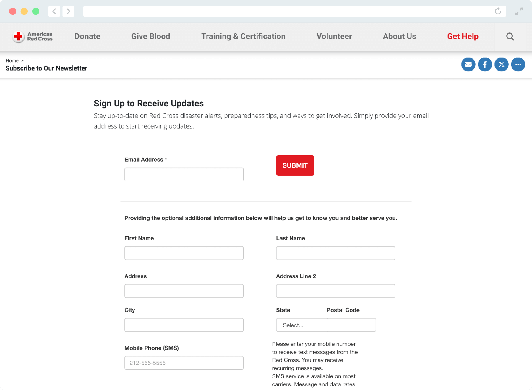
- Create a streamlined subscription process by only asking for a name and email address. Each additional information field deters potential subscribers.
- Repurpose select newsletter content on social media and encourage people to subscribe for future updates and insights.
- Make it easy for people to share your newsletters and recommend it to their personal networks, because 92% of people trust recommendations from people they know. You might create specific sections in your newsletter designed for sharing like a quotes or statistics.
- Use advertisements to target likely supporters based on demographics and interests, so you can promote your nonprofit’s newsletter to promising audiences.
Red Cross leverages some of these best practices by featuring a call-to-action on its homepage that leads to a streamlined sign-up form:

The average nonprofit email list contains around 4,191 contacts, but don’t be deterred if you have fewer! While small nonprofits have about 547 subscribers, large organizations average 6,602. Make it as easy as possible for people to sign up, and you’ll grow your subscriber list in no time.
Send Nonprofit Emails Regularly.
To retain supporters, you need to send emails frequently enough to keep supporters engaged and informed without overloading their inboxes. Not only can over-emailing land you in people’s spam boxes, but it will likely encourage people to unsubscribe altogether.
According to the latest Nonprofit Tech For Good Report, here’s how often nonprofits send newsletters:
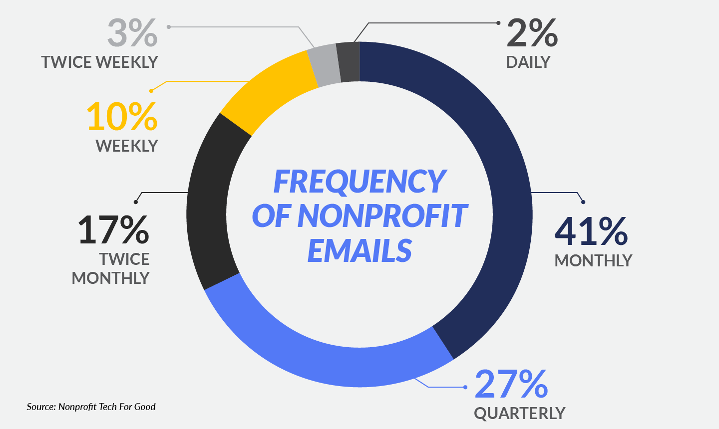
- 41% monthly
- 27% quarterly
- 17% twice monthly
- 10% weekly
- 3% twice weekly
- 2% daily
If you go longer than a month between newsletters, you might be missing out on engagement opportunities. Conversely, if you email more frequently than every week, you might fatigue your subscribers, leading to lower open rates. Align your email frequency with industry norms to encourage people to read your emails.
Above all, make sure each email includes valuable, new content. Remember, you’re not limited to your newsletter. Send other content, like donation appeals and upcoming event announcements, to stay in touch between your newsletters.
Know How To Avoid Spam Folders.
As of December 2023, spam messages accounted for over 46 percent of email traffic. If your nonprofit emails are delivered to spam folders, your supporters will likely never see them.
Avoid your messages getting marked as spam by following all relevant online privacy and marketing laws. For example, the U.S. CAN-SPAM Act requires marketers to include an opt-out mechanism and avoid deceptive subject lines. Canadian Anti-Spam Legislation (CASL) mandates explicit consent before sending emails, prohibits misleading content, and requires clear identification of the sender. Meanwhile, the General Data Protection Regulation (GDPR) is an EU regulation that requires marketers to obtain consent for email marketing, provide clear privacy policies, and offer the right to withdraw consent.
From here, use these nonprofit email marketing best practices:
- Use a recognizable sender name and email address to build trust.
- Only send emails to people who have opted in.
- Craft clear, non-spammy subject lines by avoiding all caps, excessive punctuation, and words commonly associated with spam like “urgent.”
- Provide a clear unsubscribe option.
These strategies will improve your nonprofit email deliverability and make your emails appear more trustworthy.
Personalize Your Nonprofit Emails.
Knowing who you’re writing emails for is essential for creating relevant, engaging email content that resonates with subscribers’ interests and needs. Start by looking at your subscribers’ demographics, giving history, interests, and preferences.
Our guide to nonprofit target audiences explains how to define your audience step-by-step, so you can craft content that speaks to different segments. In turn, you’ll refine your tone, timing, and calls to action to make your email marketing efforts more effective.
Your email marketing tools may offer additional personalization and segmentation features, so you can easily:
- Refer to each recipient by name
- Reference past gift amounts
- Send relevant appeals based on engagement history, such as upcoming event invitations to past attendees
Personalized emails see average open rates that are 82% higher than generic emails, making this strategy essential for building strong connections with your audience.
Improve Your Subject Lines.
Subject lines determine whether people open your nonprofit emails. As supporters scroll through their inboxes, your emails can catch their eyes if you use these best practices:
- Aim for 40-50 characters to ensure the subject line is fully visible on most devices.
- Personalize your subject lines by using recipients’ names or referencing past support. Emails with personalized subject lines are 26% more likely to be opened.
- Use action-oriented language, like “Join,” “Support,” or “Discover.”
- Highlight urgency or exclusivity by using phrases like “Last chance to give” or “Exclusive update for donors.”
- Add relevant emojis to make the subject line stand out, but use them sparingly to maintain professionalism.
Preheader text can influence open rates too. This is a short summary that appears below your subject line in a recipient’s inbox. Emails with preheader text have an average open rate of 44.67%, compared to 39.28% for emails without preheader text. Consider providing a teaser or a compelling preview of the email’s content to boost your open rate.
Optimize Your Nonprofit Emails For Mobile Devices.
Did you know that 3 in 5 people check their email on the go? And considering that 42.3% of users delete emails that aren’t optimized for mobile devices, your nonprofit emails need to be readable on smartphones.
Use emails with responsive design, meaning they adjust automatically to different screen sizes. Also, keep content concise since mobile users prefer scannable content with CTAs that are easy to find and click. Finally, compress images to load quickly and add alt text, so recipients can understand your messages even if images don’t load.
Focus on Each Email’s Design.
Your nonprofit emails’ design enhances readability and grabs attention. A strong design makes it easy for supporters to understand your content and take action, whether you want them to donate, sign up for an event, volunteer, or share the message. Plus, a visually appealing design reinforces your nonprofit’s brand and creates a professional, trustworthy impression.
Include these design elements in each email you send:
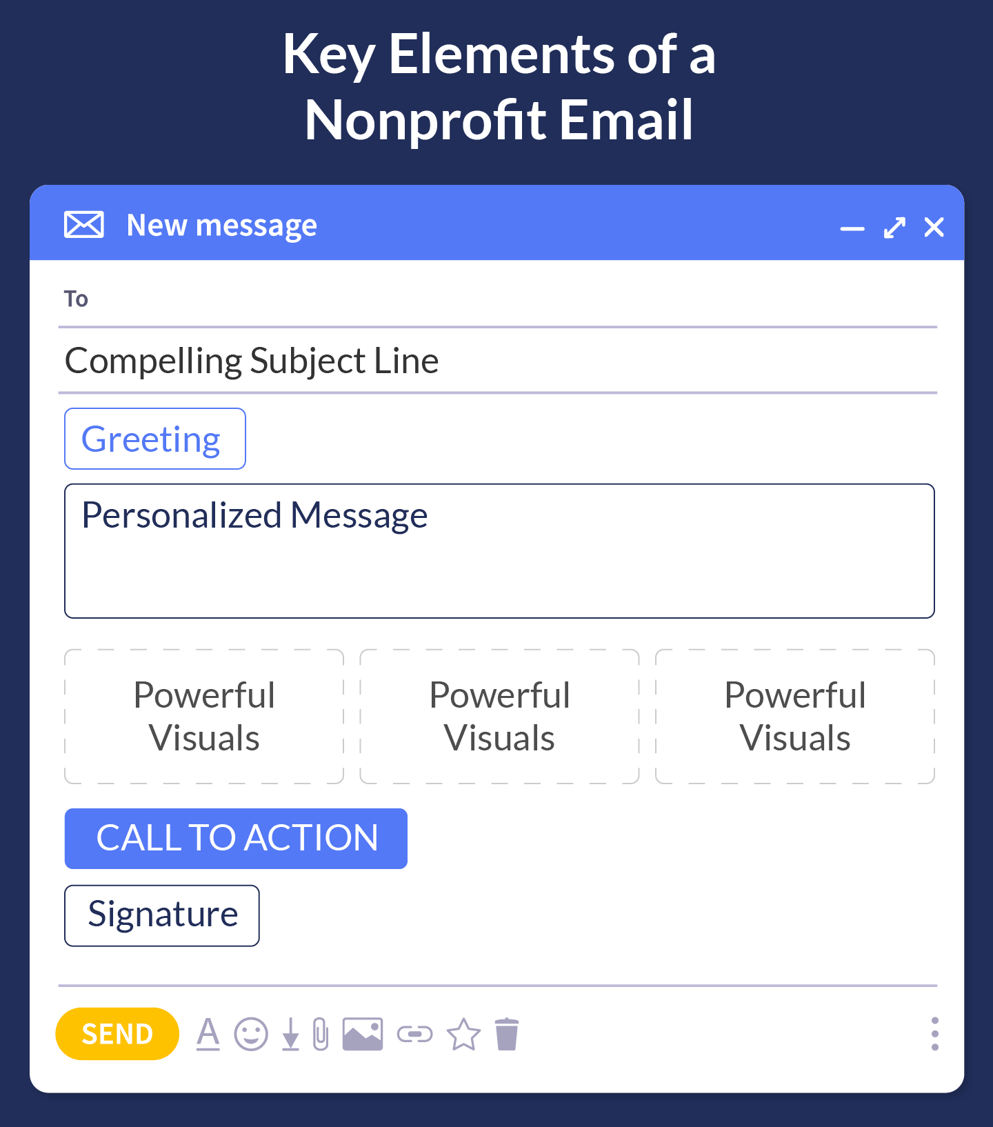
- Clear CTAs that are visually distinct and easy to click on mobile devices
- Compelling images that convey your mission, tell a story, or highlight the impact of donations
- Bulleted lists to break up text and make emails scannable
- Whitespace to avoid clutter and keep your design clean
- Consistent fonts, colors, and logos that align with your nonprofit’s visual identity
- Readable font sizes and types
- Links to your social media channels, so people can follow your nonprofit on Facebook, Instagram, TikTok, and other platforms
Save time by creating templates with these elements. That way, you don’t have to start from scratch every time you write an email.
Automate Some Nonprofit Emails.
Email automation saves your team time and ensures timely, consistent communication with supporters. This can help nurture relationships by sending relevant content based on supporters’ behavior, improving their engagement.
Here are examples of emails that nonprofits can automate:
- Welcome emails should send automatically when someone subscribes to your newsletter or joins your community by taking another action, such as donating.
- Donation confirmation and thank-you emails provide immediate acknowledgment when a donor makes a contribution, showing appreciation and providing a donation receipt.
- Recurring donation reminders to alert supporters of upcoming or missed recurring donations.
- Event registration confirmations include details and next steps after signing up for an event.
- Lapsed donor re-engagement emails to reconnect with donors who haven’t given in a while.
- Volunteer follow-up emails after an event or activity to thank volunteers and share results.
- Impact updates that share how donors’ contributions make a difference, triggered by milestones or project completions.
- Birthday and anniversary emails to recognize birthdays, donation anniversaries, or other significant supporter milestones.
- Survey and feedback emails that gather feedback after an event or donation.
- Year-end giving appeals that encourage supporters to make their year-end donations.
Your email marketing software should make automation easy. Determine which actions (e.g., signing up for your newsletter, making a donation) will trigger the automated emails. You can then design emails for different automated messages and use segmentation to ensure emails are sent to the right groups.
Monitor Your Nonprofit’s Email Marketing Performance.
Monitoring email marketing performance helps your nonprofit fine-tune its campaigns. Pay attention to the best times to send emails by testing different days and hours to see when supporters are most likely to engage.
You should also A/B test subject lines, CTA buttons, and design elements. This allows you to optimize individual components, ensuring the highest possible open and click-through rates.
We’ll explore the exact email marketing metrics you should track in a later section.
Types of Nonprofit Emails To Send
Diverse email content maintains supporters’ interest and meets different audience segments’ needs. By mixing donation appeals, impact updates, and more, you can show your nonprofit cares about more than just fundraising. Here are several types of emails you might send:
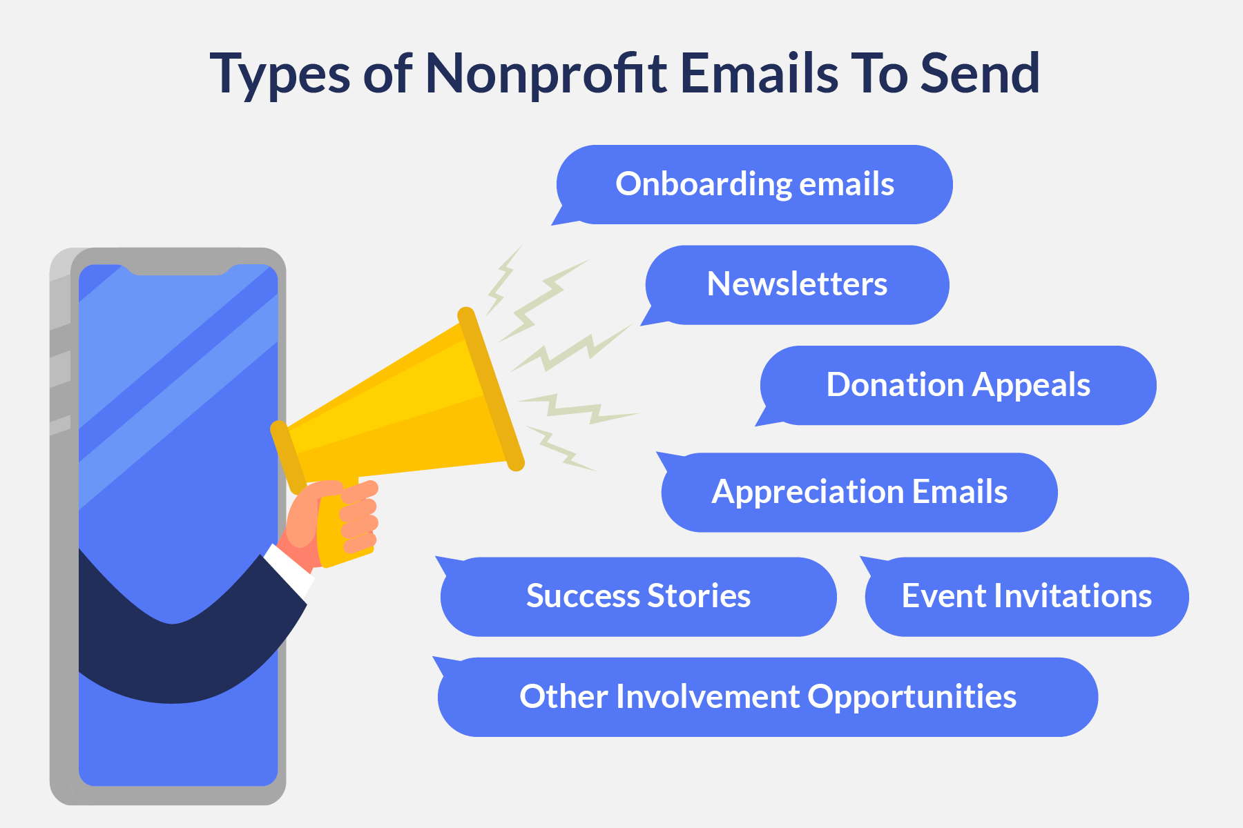
Onboarding Emails
Welcome messages have an average 202% higher open rate than traditional email campaigns. Make sure people receive a warm welcome when they first donate, sign up to volunteer, register for an event, or subscribe to your newsletter.
Your welcome email serves as an introduction to your nonprofit’s mission, provides information on how supporters can get involved, and sets the stage for future communications, ensuring they feel valued and informed right from the start. Prompt onboarding emails create a strong first impression and build early engagement with new supporters.
Newsletters
As mentioned, newsletters enable consistent communication. In them, share mission updates and impact stories to reinforce the impact of supporters’ contributions. We also recommend showcasing program milestones or behind-the-scenes updates to foster transparency.
Additionally, highlight upcoming involvement opportunities like fundraising events, volunteer opportunities, and advocacy efforts to encourage meaningful action. A well-rounded newsletter keeps supporters informed, involved, and inspired.
Donation Appeals
Requesting donations is essential for sustaining your nonprofit’s work. These emails should clearly communicate the urgency and impact of giving.
Whether you’re fundraising for your annual fund or a specific campaign, use compelling language to illustrate impact, mention past contributions, and include a clear call to action that links to your donation form.
Appreciation Emails
Around 55% of U.S. donors prefer to be thanked for their charitable gifts by email. That makes appreciation emails a smart addition to your nonprofit email marketing strategy.
Thank-you emails are a heartfelt way to thank supporters for their donations, volunteer efforts, and other contributions. These emails should express genuine gratitude and highlight how their support has positively impacted your cause. Including a brief story or statistic about the difference the supporter helped create reinforces the value of their involvement and strengthens donor loyalty.
Success Stories
Showcase the tangible outcomes of your nonprofit’s work and give supporters a clear picture of how their contributions make a difference through powerful storytelling. Use real stories, images, and quotes from beneficiaries to create an emotional connection. You may even include a video to bring your story to life further.
These emails serve as both a thank-you and a motivator to continue giving by showing supporters the direct results of their generosity.
Event Invitations
Spread the word about your nonprofit’s upcoming events. Send personalized invitations that encourage recipients to attend or volunteer. Be sure to clearly communicate the date, time, and location. Then, share registration links or ways to participate virtually, so everyone can get involved.
Other Calls to Action
Empower supporters to engage with your cause in new ways by promoting involvement opportunities other than donating. You might encourage volunteerism, advocacy, or event attendance.
These nonprofit emails can be segmented based on the recipient’s past behavior, ensuring the right appeals reach the right people. For example, lapsed donors could be sent re-engagement emails with impact stories to remind them of how their past contributions made a difference. Meanwhile, volunteers who participated in specific events might get follow-up emails inviting them to similar future events.
Key Nonprofit Email Marketing Metrics To Track
Within your email marketing software, you’ll find metrics like open rates and click-through rates. This data indicates what types of emails resonate with your audience and how well your messaging drives engagement.
To refine your outreach and better target supporters, monitor these data points:
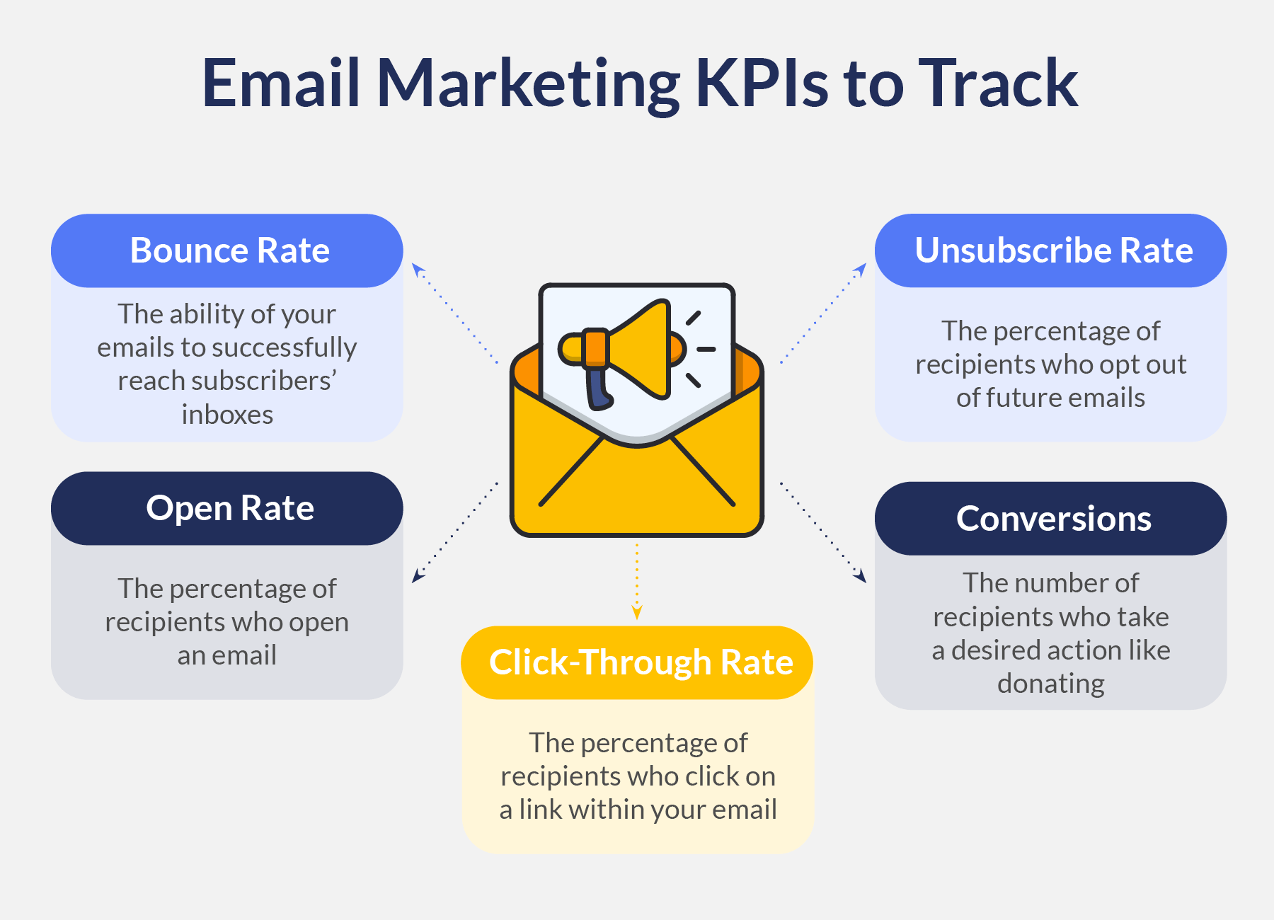
- Bounce rate refers to how many of your emails successfully reach subscribers’ inboxes, similar to nonprofit email deliverability. If you have a high bounce rate, that means your messages aren’t being delivered. To increase your deliverability, reach out to supporters via methods other than email or conduct email appends.
- Open rate is the percentage of recipients who open your email. This tells you whether your subject lines and timing are effective.
- Click-through rate is the percentage of recipients who click on a link within your email, indicating the effectiveness of your calls-to-action.
- Conversions tell you the number of recipients who take a desired action, like donating or signing up for an event.
- Unsubscribe rate is the percentage of recipients who opt out of future emails. If your unsubscribe rate is high, you might be emailing too frequently, or your content might be misaligned with supporters’ interests.
Tracking email metrics gives you valuable insights into your audience’s behavior, so you can fine-tune your outreach. Look at these messages for each email, so you can determine what’s working well and what can be improved.
You can also compare your metrics to industry benchmarks. We recommend looking at key performance indicators (KPIs) for your specific email platform. For instance, Mailchimp has a 40.04% average email open rate for nonprofits, while GetResponse has a 54.54% average email open rate for nonprofits.
If your metrics underperform compared to your platform’s benchmarks, make adjustments and A/B test specific elements until you see improvement.
How Google Ads Can Fuel Your Email Marketing Efforts
Use your nonprofit’s other marketing channels to build your subscriber list. As the world’s most popular search engine, Google is one of the best channels to promote your cause. According to our Google Ad Impact Report, Google claims over 90% of the search market and processes an incredible 3.5 billion search queries every day.
Considering that 98% of searchers click a result on page 1 of Google, you want your nonprofit’s website to rank as high as possible for mission-related keywords. That makes Google Ads a promising platform to get your site in front of people who are actively searching for causes like yours.
Not to mention, eligible nonprofits can claim free advertising credits via the Google Ad Grants program. With the grant, you can promote your website’s content to users for free. The goal of the program is to drive meaningful actions like donations and email subscriptions. Here’s a rundown of the Google Ad Grant’s benefits.
Here’s how to use Google Ads to grow your nonprofit’s email subscriber list:
- Optimize landing pages. Direct your Google Ads to email sign-up pages with a simple, user-friendly process.
- Use compelling calls to action. Highlight the benefits of subscribing, such as exclusive updates, special offers, and valuable content.
- Offer exclusive content. Promote sign-up incentives like eBooks, reports, and other exclusive content.
- Target specific audiences. Use Google Ads’ targeting features to reach users who are likely to be interested in your content and email list.
- Use remarketing ads. Use Google’s remarketing feature to target users who have visited your website but haven’t subscribed yet to encourage sign-ups.
Google Ads can be a great way to build your contact list if you’re strategic about it! Even if you don’t want email subscriptions to be your primary conversion action, you can use features like sitelinks to add your email sign-up form to your ads.
If you need help creating compelling ads, reach out to our Google Ad Grants team. We work with nonprofits to help them apply for the grant and craft ads that drive results.
Next Steps To Improve Your Nonprofit Emails
Nonprofit email marketing is powerful for building lasting relationships, increasing engagement, and driving donations. If you already send emails, start by taking a look at your current performance. Are your open rates low? Are your emails driving conversions?
Then, implement the nonprofit email marketing best practices we covered, like segmenting your audience and delivering diverse content. In no time, this channel will become an indispensable part of your nonprofit’s marketing plan.
Need help refining other parts of your communications? Check out these resources:
- Nonprofit Content Marketing: Create Content Supporters Love. Email is just one type of content marketing. Learn how to showcase your organization’s expertise with blog posts, videos, and more.
- Creating Meaningful Messages: Copywriting for Nonprofits. The success of your nonprofit emails hinges on effective copywriting. Discover how to write compelling messages that inspire people to take action.
- Google Grants Eligibility: How to Check Yours & Get Started. Google Ads are an effective channel for growing and connecting with your audience. Find out if your nonprofit is eligible for free Google Ads credits in this guide.
