
Your Nonprofit Branding Strategy Can Probably Be Better
A well-defined and recognizable brand can do wonders for any organization or business. Recent studies have shown that 26% of nonprofits have rebranded in the past two years — and of these, around half (47%) have already seen an increase in revenue. This means that if you think your branding could be improved, you’re probably right.

To help you learn how to take your nonprofit branding strategy to the next level this guide will cover:
- Why Does Nonprofit Branding Matter?
- Essential Brand Guide Components to Improve
- 5 Nonprofit Branding Strategy Best Practices
- 5 Smart Nonprofit Branding Examples
At Getting Attention, nonprofit marketing is our specialty. By harnessing the power of the Google Ad Grant, we connect nonprofits with the right audiences to drive impact and build support.
Why Does Nonprofit Branding Matter?
It takes anywhere from 17 to 50 milliseconds for people to form a first impression about your brand. Use a bulletproof nonprofit branding strategy to make the most of these precious few seconds.
Effective branding makes your nonprofit more easily recognized. This directly affects whether people see your messaging and feel compelled to take action.
This is why it’s so important to create branded content and messaging. With the right strategy, supporters can build a relationship with your brand and instantly recognize and trust it. Think about the American Red Cross—as soon as you see it, you know exactly who this organization is and what they do. To summarize, nonprofit branding is important because it:
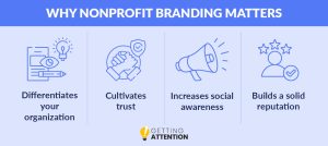
- Differentiates your organization: Your nonprofit should be recognized for your own incredible work, which means it’s important to stand out from other similar organizations. Therefore, your brand will need to be representative of your organization’s unique values and mission.
- Cultivates trust: Effective and consistent branding ensures individuals that your organization is legitimate and well-known. The more they see your logo or hear your name, the better.
- Increases social awareness: The more people see your branding, the more people will know about your mission and need.
- Builds a solid reputation: When your nonprofit brand touches your entire community, supporters will much more easily regard you as trustworthy and highly reputable.
Thoughtful branding execution is an ongoing process. Your nonprofit branding strategy is made of several moving parts that must be managed to create a memorable These moving parts are consolidated into your nonprofit brand guide.
Essential Nonprofit Brand Guide Components to Improve
Who is your organization? A descriptive answer to this question should be captured in your nonprofit brand guide.
This document contains your brand “rules” and ensures that your marketing team is on the same page concerning all components. Without these rules, your branding will be inconsistent and unrepresentative. Your brand guide should be detailed and include use cases for both digital marketing and print materials.
Here is what to include for both messaging and visual elements:
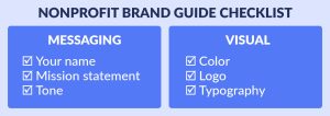
Your Name
It’s common to have different names depending on which region your headquarters occupy. Additionally, some organizations decide to go by acronyms. Take M.A.D.D. or Mothers Against Drunk Driving for example. In this case, the acronym carries an emotional meaning that underlies the group’s cause. Most likely, you’ve already landed on your nonprofit name. To test its effectiveness, ask these questions:
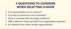
Hopefully, you have answered “yes” to the above questions. If not, it’s time to re-evaluate your nonprofit name to be sure it accurately reflects your organization’s values.
Mission statement
Your mission statement is the core purpose of your nonprofit organization. When crafting your own nonprofit mission statement, make sure to include WHY your nonprofit exists, WHO your nonprofit is helping, and HOW your nonprofit serves them. Your WHY of your mission statement explains your vision, or how your organization would like positive change the world.
For example, The Nature Conservancy captures its mission and vision statement in a memorable and concrete way:
Mission: “To conserve the lands and waters on which all life depends.”
Vision: “A world where the diversity of life thrives, and people act to conserve nature for its own sake and its ability to fulfill our needs and enrich our lives.”
The above points answer WHAT the organization is helping (lands and waters) and WHY (to increase the diversity of life). The Nature Conservancy’s “See Our Priorities” link captures the HOW of their nonprofit mission and breaks it down into goals to meet by 2030.
Tone
Your tone describes how you communicate as an organization. Are you urgent or excited? Welcoming or focused? Your chosen tone is an aspect of your overall nonprofit personality and should be representative of how you approach your cause.
A practical application of tone is your tagline. It should be short, catchy, and representative of your mission. For instance, the Montana Historical Society uses the tagline “Big sky, Big land. Big history” to encompass its promise to uphold Montana tradition.
Color
The colors you choose for your nonprofit branding can greatly influence how your audience feels when they see your organization out and about online or in person. When determining the best colors to represent your brand, try to think of the emotions that colors evoke.
For instance, green is often associated with nature while red is associated with passion or urgency. To get a full view of brand color associations, refer to this guide:
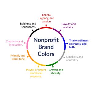
- Red: Represents energy, urgency, and passion. Many health-related organizations use this color.
- Purple: Evokes royalty and creativity. It can also evoke stability as many religious organizations use this color.
- Blue: Exhibits trustworthiness, openness, and faith. Human rights organizations use blue to back their missions of providing humanitarian aid.
- Gray: Indicates simplicity and neutrality. Organizations that use this color offer a calmer aesthetic.
- Green: Pictures growth and stability. Many conservation-based or environmental organizations tie in their values with green.
- Yellow: Elicits a playful or urgent emotional response. Yellow is also used to demand attention and spread awareness.
- Orange: Encompasses a friendly and warm tone. Wildlife rescue groups commonly use this color.
- Pink: Represents creativity and innovation. Many movements in the 2SLGBTQ+ utilize this color.
- Black: Indicates boldness and seriousness. Several justice groups use this color to mobilize their mission.
As you finalize your color palette, be mindful of existing color associations. For example, pink is also tied to the breast cancer awareness movement. Other considerations include political party and international color meanings.
It’s best to choose one primary color and 2-3 secondary colors to complement it. This way, your branding will remain simple and impactful.
Logo
Your logo is the center of your brand. It’s the image that people remember most and will recognize the easiest. Using your logo consistently helps create an association to your brand and builds the relationship supporters have with your nonprofit’s content. There are three types of logos to consider:
- Wordmark logos include your nonprofit name and can be more useful if your organization is not well-known
- Symbol logos include only the symbol of a nonprofit such as the YMCA’s “Y” symbol.
- Combination marks capture your mission by showing your name and a symbol. These are the most common logo type.
Whichever you choose, ensure your logo evokes the right emotion and is communicative of your mission.
Typography
Your font choices should align with your colors and logo. Sans serif fonts are a popular choice due to their readability and straightforwardness.
Consider selecting two fonts from the same family with different weights to add hierarchy to your visual brand. Use the heavier font weight for headlines and the lighter font for descriptions.
5 Nonprofit Branding Strategy Best Practices
Now that you’ve nailed your nonprofit brand guide, it’s time to explore how to use it to turn more heads and inspire greater support. Consider these best practices to catapult your nonprofit branding forward, connect with your audience, and deliver your messaging in ways that inspire support:
- Make your branding stand out: There are more than 1.5 million nonprofit organizations registered in the U.S. alone. Find ways to make your nonprofit stand out from the crowd to garner the necessary support. This is especially important for nonprofits with similar missions.
- Craft a compelling story: As you now know, nonprofit branding is more than just what your website and social media posts look like. It involves how you connect and communicate your stories. To take your branding to the next level, consider employing nonprofit storytelling methods. This is one of the most powerful ways to build your brand, cultivate trust with your audience, and promote your mission.
- Use branding on multiple channels: Branding should represent your organization consistently regardless of its platform. The marketing channels you use are incredibly important especially if you want to build relationships with donors and reach new prospects. Make your branding consistent on every channel so that supporters can recognize you immediately and continue their relationship with your brand.
- Update branding as needed: As with any marketing effort, it’s important to collect data and track its success to learn if there’s anything that needs to be improved or optimized. To ensure your branding stays on track and helps you meet goals, we recommend compiling regular reports and following metrics like social media interactions and email open rates.
- Apply for the Google Grant — One of the best ways to build your branding strategy and connect with supporters is to apply for the Google Ad Grant! With this grant, nonprofit organizations receive $10,000 in Google ad credits each month. Plus, all eligible nonprofits who apply can receive this grant, not just a select few like with most other grants. Use your Google ads to build your brand and reach more people, faster.

Your nonprofit branding strategy impacts many aspects of your marketing efforts and donor relationships. Leverage these best practices to ensure that your branding not only represents your organization and mission effectively but that you’re able to incorporate it into key messaging and connect with supporters in valuable ways.
5 Smart Nonprofit Branding Examples
Sometimes the best way to visualize your nonprofit brand is by being inspired by other successful brands in your space. Analyzing what makes their branding so memorable and effective will help you learn the ropes or enhance your existing branding.
To help you get started, we’ve compiled a list of the top five nonprofit brands to watch. We’ve included a snapshot of each’s colors, logos, and messaging, so you can see how each organization weaves its messaging into its brand.
Nonprofit Branding Example 1: Oxfam
Oxfam is a humanitarian organization dedicated to ending inequality. They call on supporters to fight injustice and poverty as one united community. Here’s what their branding looks like:
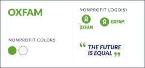
- Mission statement: “Equal treatment free from discrimination. Equal rights under the law. Equal opportunities to build a life and thrive. For everyone.”
- Colors: Warm green and white
- Logo: Green simplistic ox
- Tagline: “The future is equal”
Oxfam’s branding reflects its values. The warm green exudes a friendly and welcoming personality that invites everyone to join in their movement. The soft logo does not include divisions or harsh lines as a reminder that everyone deserves a chance to thrive, not just survive. Additionally, Oxfam focuses on the word “equal” in its messaging to echo its mission statement.
Nonprofit Branding Example 2: Feeding America
Feeding America is the largest hunger relief organization in the United States and represents a nationwide network of food banks and pantries. Their vision is to create a hunger-free nation. Here’s a glimpse of their branding:
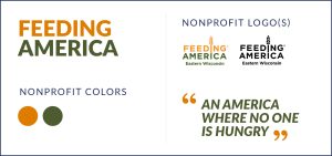
- Mission statement: Our mission is to advance change in America by ensuring equitable access to nutritious food for all in partnership with food banks, policymakers, supporters, and the communities we serve.
- Logo: Wordmark with wheat symbol
- Tagline: “Our vision is an America where no one is hungry”
- Colors: Orange, dark green
Feeding America’s mission statement is perfectly captured in its branding materials. Its inclusion of wheat and use of warm, inviting colors signal its promise to end hunger. The use of orange is also commonly used in relation to commercial food logos, mimicking Feeding America’s vision to provide meals for those in need.
Nonprofit Branding Example 3: charity: water
Charity: water is an organization dedicated to increasing clean drinking water access. Founded in 2006, it has been working to help end the water crisis through local partners and supporters. Here is how they use their story to capture their branding:
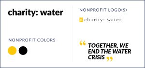
- Mission statement: “To bring clean and safe drinking water to every person on the planet”
- Logo: Jerry can
- Tagline: “Together, we end the water crisis”
- Colors: Yellow and black
Charity: water’s jerry can has become famous in the nonprofit logo world because it represents the work this nonprofit does in a succinct and memorable way. Millions of developing communities rely on jerry cans for clean drinking water transport. Therefore, the inclusion of this symbol speaks to charity: water’s promise to bring safe drinking water to its beneficiaries.
Nonprofit Branding Example 4: The Backpack Project
The Backpack Project (TBP) is a student-run organization dedicated to easing the burden of homelessness by delivering backpacks containing food, toiletries, and other necessities to those experiencing homelessness. Here’s how their brand echoes this sentiment:
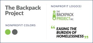
- Mission statement: “to contribute to the collective effort that characterizes homelessness “rare and brief.”
- Logo: Backpack zipper
- Tagline: Easing the Burden of Homelessness
- Colors: Light green and gray
TBP’s branding’s star feature is its simplicity. Rather than featuring a stuffed bag to visualize the nonprofit’s mission, TBP features only a zipper to get its message across. The zipper is a nod to the backpack, but also a hope that more people experiencing homelessness will be able to “unzip” a better future where they can characterize their experience as “rare and brief.”
Nonprofit Branding Example 5: Pencils of Promise
Pencils of Promise is committed to providing quality education to children in need. They provide teacher support, WASH (water, sanitation, and hygiene) programs, and quality infrastructure to enhance learning environments. Here is how their brand captures their values:
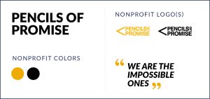
- Mission statement: “Every child should have access to quality education. We create schools, programs, and global communities around the common goal of education for all.”
- Logo: Yellow pencil combination mark
- Tagline: “We are the Impossible Ones”
- Colors: black and yellow
Pencils of Promise’s simple logo goes for the obvious without becoming intrusive. The pencil shape tells people immediately that this organization is education-centered. Pencils of Promise’s language is also bold and hopeful as reflected in its choice of bright yellow and stark black (which are also the colors of a classic No. 2 pencil!).
Additional Resources
There’s a common misconception that nonprofit branding only refers to your organization’s aesthetics. However, it extends beyond color palettes and fonts, as your brand messaging can directly impact your nonprofit’s marketing and fundraising success. If you want to reach your supporters where they are and spread awareness of your mission, having an effective branding strategy is essential.
To continue your research in learning how to push your nonprofit forward, we encourage you to explore our additional resources for nonprofit branding and marketing:
- Fundraising Flyers: How to Boost Nonprofit Marketing – Revitalize your fundraising with expert fundraising flyer tips. Read this guide for tips and examples on how to bring your fundraising flyers to life.
- Nonprofit Advertising: The Essential Guide (With Examples!) – Branding is one key aspect of successful nonprofit advertising. Refer to this guide for tips on how to fortify your advertising strategy.
- Demystifying the Google Ad Grant Requirements for Websites – The Google Ad Grant can revolutionize your marketing strategy. Learn how to hit all the major requirements in this guide.