Consistency and Impact: Creating a Nonprofit Style Guide
Last Updated on April 23, 2024
Picture this: You see an ad on social media for a nonprofit. You click on it, but the website has a different logo. For most of us, this would seem suspicious, and the donor journey would stop there, even if the organization was completely legitimate.
When it comes to marketing your nonprofit, consistent branding is essential. Most nonprofits are aware of this, and as such, many have style guides. But what is a style guide and how can your nonprofit put one together?
To answer these questions, this guide will explore:
- What is a nonprofit style guide?
- Why does my organization need a nonprofit style guide?
- Elements of a Nonprofit Style Guide
- Nonprofit Style Guide Best Practices
These actionable strategies will transform your nonprofit’s marketing strategy into a professional, cohesive, and consistent plan. By doing so, you can better connect with donors, sponsors, volunteers, customers, beneficiaries, and other important stakeholders.

What is a nonprofit style guide?
A style guide is a document that explains how individuals creating content for your nonprofit should present your organization. Nonprofit style guides vary in complexity and level of detail. In particular, there are three main types of style guides to consider creating:
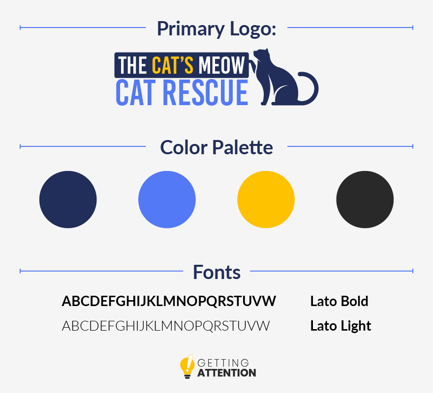
- Cheat sheets are short documents, often just one or two pages, that provide a quick overview of key aspects of your brand. These documents are easy to share and help you find what you’re looking for quickly (as long as it’s included in the cheat sheet). For example, a visual style guide cheat sheet might look like this:
- Style guides can vary in length but are often between five and ten pages. While you can create a style guide for just visual or editorial branding, many style guides touch on both of these core topics and provide a moderate level of detail and examples.
- Brand books are long documents that cover every part of your branding, provide examples, and go into minute details where necessary. These documents tend to be long. For example, charity: water’s 2016 brand book clocks in at 86 pages. Think of a brand book as the ultimate source of truth that your other style guides take excerpts from.
When putting together your first style guide, take the middle-of-the-road option. While you should aim to create a brand book if you have a firmly established brand identity, putting this document together is not practical if you lack any form of style guide and need to create one fast.
Why does my organization need a nonprofit style guide?
When your nonprofit is just getting started or if you haven’t solidified your brand identity yet, creating a style guide might not be your priority. However, this is a core document for your marketing team, and creating one helps your nonprofit’s communication strategy by providing:
- Consistency. Your style guide is a set of rules that ensures key brand elements, such as your logo, colors, and typography, always appear the same way every time you use them. By improving consistency, you also improve brand recognition, trustworthiness, and professionalism.
- Brand building. Creating a style guide is an opportunity to solidify your brand. Longer guides, like brand books, require nonprofits to talk through nearly every aspect of their branding. When putting your style guide together, think critically about how and why you have and use the brand elements that you do. This can help you better understand your target audience, mission, and marketing approach.
- Easy sharing. If you have a marketing team of more than one, plan to run a peer-to-peer campaign, or want to work with an external marketing agency, you need a style guide. Rather than communicating your brand specifications piecemeal, you can easily send stakeholders your complete or abridged style guide when they help out with your marketing efforts.
Completing a style guide is your nonprofit’s first step to establishing and standardizing your brand. By building up brand recognition, you can increase both supporter acquisition and retention. New supporters will recognize your nonprofit’s ads each time they see one, increasing the chance they’ll decide to make a conversion.
Elements of a Nonprofit Style Guide
To help your nonprofit understand what goes into a style guide and the level of detail needed for each section, this guide will take a look at the core elements of a nonprofit brand book. We hope you like birds because we’ll be taking a deep dive into The National Audubon’s brand book for examples.
Brand Overview
Most style guides and almost all brand books begin with a brief introduction that explains the guide’s purpose and how it should be used. This might include a description of the nonprofit, its values, and its overall brand identity. Or, it may simply state why the nonprofit feels having a consistent brand design is important.
Let’s take a look at Audubon’s introduction:
Many Nests, One Audubon
Audubon’s reach is hemispheric, with our many state offices, sanctuaries, and nature centers creating a powerful network of conservation.
Because of the many ways and places people may experience Audubon’s work, it is critical that we communicate as a single, unified brand—that we are One Audubon. Each time someone sees our materials, visits a nature center, attends a state lobby day, or uses our mobile app, the look and feel of their experience should be consistent, meaningful, and unmistakably Audubon.
This overview provides examples of situations where supporters may interact with Audubon’s brand identity and emphasizes that because Audubon is a nonprofit with chapters across the country, maintaining consistency is especially important for building brand recognition.
Logo
The logo section of a nonprofit style guide usually goes over three main topics:
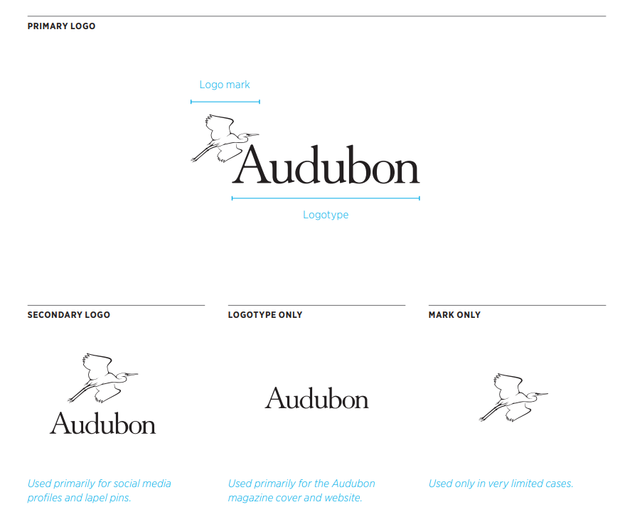
- Variations of the logo. Most nonprofits have several versions of their logo they use in various contexts. Audubon has four primary variants of its main logo, including their primary logo, one for social media, a text-only version, and an image-only variant.
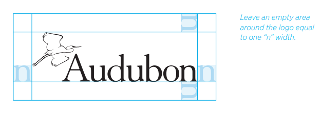
- Spacing of logo elements. How much space do you want between your logo and other text? This might seem arbitrary, but mandatory spacing and sizing can help your logo stand out and ensure it’s always legible.
- How the logo should not be used. It’s generally agreed that logos can be resized or even recolored depending on the context. However, most nonprofits have explicit directions for how the logo should not be distorted, like adding additional text, changing the font, adding unapproved colors, or removing elements.
![]()
Depending on the size of your nonprofit, you may need additional logo guidelines. For example, if you have multiple regional offices, it may be necessary to explain how these groups can add their chapter name or location to the logo.
Colors
Name each brand color, provide a swatch example, and share its hex code and CMY and RBG values. This is especially important since colors appear differently on different monitors and in print format.
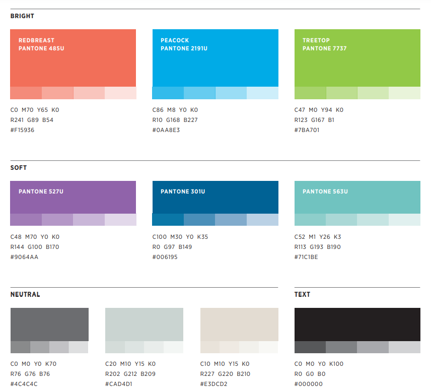
It can be helpful to add examples of what various brand elements look like in practice, and this is especially true for color. After all, you may have several brand colors that your graphic design team can use but likely shouldn’t use in certain combinations.
It can also be useful to explain your design philosophy when discussing color. For example, Audubon discusses that their approach is to pair one bright color with muted and neutral tones. This context guides graphic designers to ensure they apply colors in ways that make sense for your brand.
Typography
What fonts and typefaces does your nonprofit use? Share the name of the fonts you use and type out the alphabet in capital and lowercase letters, numbers 0-9, and common punctuation marks in that font.
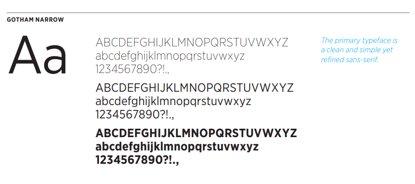
Some fonts have multiple font weights, and nonprofits might use these for various situations. For instance, you might show what the font looks like in light, medium, and bold for comparison so your marketing team can choose which version will look best for the materials they’re creating.
Additionally, if you use different fonts for different contexts, explain that as well. For example, you might have a font that is used for digital communication and a separate one for print.
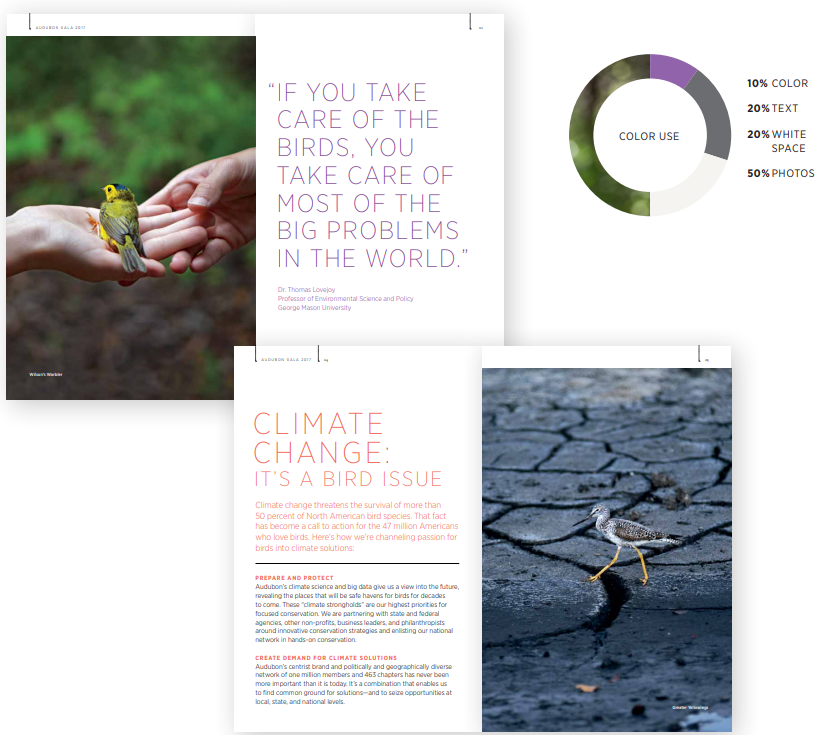
Photography
There are four things you should include in your style guide’s photography section:
- Your photo library, if you have one.
- Your photography guidelines. For new photos, explain what you will and won’t accept when it comes to composition and quality.
- Advice for using newly taken photos of various subjects. For example, Audubon has directions for how to use photos of birds, people, habitats, and visuals that tell a story.
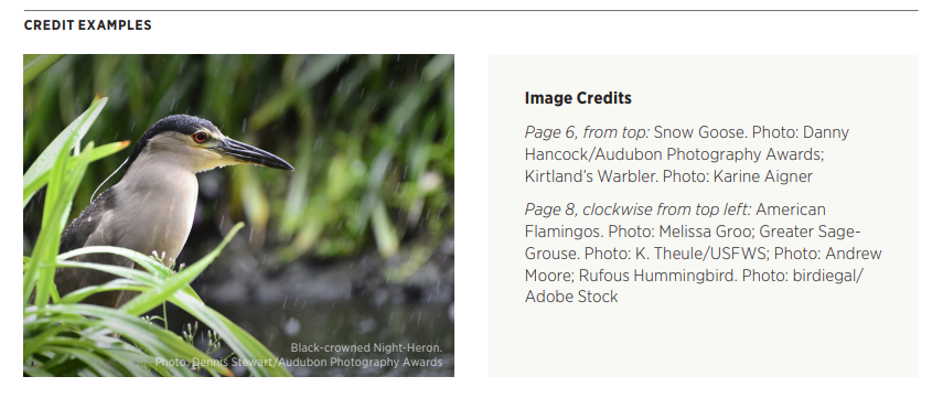
- Crediting and copyright procedures. You should have legal permission to use all photos in your nonprofit’s marketing materials. Get releases from everyone involved in a photoshoot, and add credits to photographers and illustrators in a readable but unobtrusive format.
Graphic Design
Many nonprofit style guides lack a dedicated graphic design section and instead rely on their colors and photography sections to guide illustrators. However, if your nonprofit has specific icons or graphic design elements you regularly use, a section detailing how to access and incorporate them can be helpful.
For example, Audubon’s brand book has a section on the various icons the organization regularly uses:
![]()
Mission
Your nonprofit’s full mission statement may be several sentences explaining what your organization does, the impact your services have, and why your organization is uniquely suited to tackle these challenges.
However, for marketing purposes, it’s often useful to have a shortened version of your mission that can be easily used whenever you need to explain what your nonprofit is and make your cause for support quickly.
For example, Audubon’s short mission statement is: “The National Audubon Society protects birds and the places they need, today and tomorrow.” This is short, punchy, and can be added to marketing materials without taking up too much space.
Tone and Style
For the editorial section of your nonprofit style guide, your goal is to explain your nonprofit’s writing voice in a way that allows multiple writers to replicate it. This guide can be extensive and usually includes:
- Tone. What impression do you want supporters to have of your nonprofit and how can you present that in writing? For example, is your nonprofit casual, playful, professional, profound, or something else? Provide example sentences and phrases that demonstrate your tone so writers will understand what subjective descriptors like “approachable” mean to your nonprofit.
- Punctuation and grammar. Provide direction for how to use common acronyms associated with your nonprofit, whether you use the Oxford comma, and whether headlines should be sentence case or title case.
- Capitalization, italics, bolding, and others. Writing is complex, and many edge cases will crop up. This means that brand books for major organizations tend to have very detailed style guides. For instance, the U.S. Figure Skating Style Guidelines is a 17-page PDF that addresses as many writing concepts related to figure skating as possible, including a paragraph about when and how to use ellipses, whether “gold” should be capitalized when referring to a gold medal, and the differences between “long time, longtime, long term, long-term.”
Your nonprofit’s editorial style guide does not need to be as intensive as those of Audubon or U.S. Figure Skating, but use these examples for the types of writing concepts and scenarios you should consider.
Terminology
The terminology sections of nonprofit style guides often look like annodated glossaries. These sections list various words and phrases likely to come up in writing and provide direction for how they should be used. These sections discuss:
- Brand-related terms. List terminology that you feel needs explaining (such as an acronym) or may cause confusion. For example, Audubon’s style guide specifies that “birdbath” is one word while “bird feeder” is two.
- Terms to avoid. This can be a matter of stylistic preference, such as using “okay” over “OK,” but there may be other stipulations related to your brand identity and inclusivity to specify. For example, public radio and journalistic publications, like NPR, usually have extensive guidelines on what terms to use and avoid, such as “undocumented” over “illegal aliens.”
- Abbreviations. Many nonprofits use acronyms and have specifications for what these acronyms are and when they should be used. For example, The National Audubon Society is abbreviated to “Audubon” not “NAS” or any other acronym. In contrast, NPR is clear that the organization’s full name is National Public Radio but is much more relaxed at being referred to as NPR.
Extensive writing guidelines might seem like overkill, but remember that writing is a part of almost all of your nonprofit’s external communication. As such, maintaining consistency in writing tone and style is essential for building a cohesive brand identity.
If your nonprofit intends to work with external marketing agencies, such as an SEO marketing firm, the more detailed the editorial sections of your style guide are, the better. This will help these agencies properly showcase your nonprofit’s expertise, mission, and products and services.

Social Media
Social media has its own stipulations to ensure your brand comes off well on a variety of platforms. Most organizations advise marketing teams to follow their normal tone, style, and terminology rules when posting on social media.
Nonprofits with multiple regional offices, like Audubon, might encourage specific branches to get creative and find their own voices, whether that means one group posts research reports and another exotic bird photos. However, they do have a few stipulations for social media marketing, such as not posting fundraising appeals for other organizations or making political statements.
If your nonprofit has just one organization under its banner, your digital communications should remain consistent across all platforms, including social media, search engine ads, and email communications.
Print Materials
How should your branding translate to physical documents? Consider what print materials your nonprofit regularly produces and provide exact measurements and formatting directions for them. For example, a few common types of print materials include:
This is a section that needs lots of templates. Visual references can help marketers ensure they’re inputting the right measurements, decreasing the need for reprints.
Video
Video is a newer medium than illustrations and text, but it’s still one you should consider, especially as video marketing continues to soar in popularity. For video, provide branding details about:
- Screen ratio, pixel resolution, and video orientation. These details might be consistent for all platforms, but you may also have some exceptions, such as allowing portrait orientation for social media sites like TikTok and Instagram.
- Production credits. Generally, any text, including production credits and opening titles, should be in one of your brand fonts. If you have unique preferences for video, add that information.
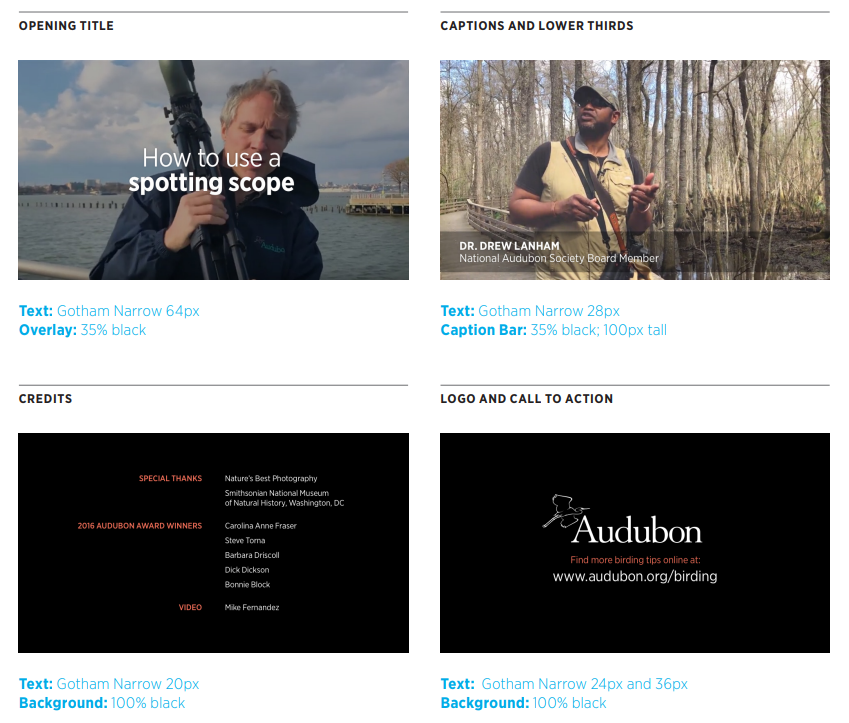
- Content. If there is a specific way you want parts of your nonprofit, target issue, or message to be presented, explain why and how it should be done. For instance, this might be details about how your calls to action are displayed.
Just like you would share your style guide with graphic designers and writers, this section should be shared with your video production team. You may even consider creating a video-specific cheat sheet rather than sharing your entire style guide.
Nonprofit Style Guide Best Practices
Knowing the core elements of a nonprofit style guide is a strong first step in creating one. However, some style guides are more helpful than others. To ensure your nonprofit makes use of yours, follow these best practices:
- Include templates and examples. Certain branding and design concepts, such as your nonprofit’s editorial voice, may be hard to explain without examples. After all, a “casual tone” could mean using emojis, slang, or just opting to use “hi” instead of “hello.” Templates, boilerplates, and examples show how your brand should be displayed in various contexts, making it easier for anyone using your brand guide to apply it to their unique marketing situations.
- Make your guide searchable. If you plan to create a long style guide, like a brand book, ensure you choose a format that is easy to search. For instance, Audubon has a searchable PDF with a table of contents, letting users find the content they need quickly.
- Work with an external agency. If you need help forming your nonprofit’s brand or putting together a style guide, consider partnering with a nonprofit branding agency. Whether you need support with messaging, graphic design, or content writing, professional consultants can help you create a brand identity that fits your organization.
Remember, you can edit your style guide after creating it, and many nonprofits regularly refresh their brand books to reflect any changes. If you plan to rebrand, it may be necessary to start from scratch, but in most cases, if you realize there’s something you forgot or want to change, you can update your style guide without issue.
More Marketing Resources
Your nonprofit’s style guide is an essential document that allows your team to keep your brand consistent and expand your marketing efforts. Continue to follow and update your guide as your brand changes alongside your nonprofit.
With your brand resources ready to go, nonprofits can then launch their marketing campaigns. To get more marketing help, try these resources:
- Nonprofit Advertising: The Essential Guide (With Examples!). Having a solid brand identity is essential for effective nonprofit advertising. Learn how to take the next steps after completing your brand guide.
- 5 Nonprofit Marketing Ideas You Need to Promote Your Cause. With a consistent brand, your nonprofit can launch a variety of marketing campaigns. Get inspired with these ideas.
- Kwala. Need graphic design help? Get in touch with the team at Kwala who specializes in designing images and brand assets for nonprofit organizations.